flowchart LR
    A["1. synthetic_control()<br/>declare treated unit<br/>and intervention time"] --> B["2. generate_predictor()<br/>define matching variables<br/>(one call per time window)"]
    B --> C["3. generate_weights()<br/>optimise donor weights<br/>(quadratic programming)"]
    C --> D["4. generate_control()<br/>build synthetic California<br/>and post-period gap series"]
    D --> E["5. plot_/grab_ helpers<br/>trends, weights,<br/>placebos, MSPE ratio,<br/>Fisher exact p-value"]

    style A fill:#6a9bcc,stroke:#cbd5e0,color:#fff
    style B fill:#6a9bcc,stroke:#cbd5e0,color:#fff
    style C fill:#6a9bcc,stroke:#cbd5e0,color:#fff
    style D fill:#d97757,stroke:#cbd5e0,color:#fff
    style E fill:#00d4c8,stroke:#cbd5e0,color:#141413
5 Classical Synthetic Control
5.1 The SCM idea
Synthetic Control stops using one control state. Instead, it builds a weighted combination of donor states that matches the treated unit’s pre-period as closely as possible on a chosen set of predictors. The weighted combination is “synthetic California”. The gap between observed California and synthetic California is the estimated effect.
Why it works where DiD failed. Difference-in-Differences against Nevada (chapter 4) needed parallel pre-trends with one neighbour. Synthetic Control needs parallel pre-trends with a data-driven blend of many neighbours. The optimisation does the matching, so the analyst no longer has to pick “the right” control state by hand.
5.2 The four-stage tidysynth pipeline
Stages 1–4 produce the estimate. Stage 5 is a battery of inspection helpers — plot_trends(), plot_differences(), plot_weights(), plot_placebos(), plot_mspe_ratio(), grab_unit_weights(), grab_predictor_weights(), grab_balance_table(), grab_significance() — that turn the fitted object into figures and tables. We use all of them below.
5.3 The equation
Let \(X_1\) be the vector of \(k\) pre-period predictors for the treated unit (California), and let \(X_0\) be the \(k \times J\) matrix holding the same predictors for the \(J = 38\) donor states. The Synthetic Control estimator chooses donor weights \(w\) to minimise the (V-weighted) discrepancy between treated and synthetic on the predictors:
\[w^* \, = \, \arg\min_{w \in \mathcal{W}} \, \big(X_1 - X_0 w\big)^\top V \big(X_1 - X_0 w\big),\]
subject to
\[\mathcal{W} = \big\{w \in \mathbb{R}^J \,:\, w_j \ge 0 \,\, \forall j, \,\, \textstyle\sum_{j=1}^J w_j = 1\big\}.\]
The diagonal matrix \(V\) holds the predictor importance weights — the optimiser can care more about pre-period cigarette sales than about, say, beer consumption (we inspect \(V\) below). Once \(w^*\) is solved, the synthetic California outcome at any year \(t\) is
\[\widehat{Y_{1t}(0)} = \sum_{j=1}^J w_j^* \, Y_{jt},\]
and the ATT over 1989–2000 is the mean post-period gap between observed California and that synthetic counterfactual.
5.4 Setup and data
Packages. tidyverse covers wrangling and plotting. tidysynth is the workhorse for this chapter: it wraps the classical Abadie-Diamond-Hainmueller synthetic-control optimiser behind a tidy pipeline of synthetic_control() |> generate_predictor() |> generate_weights() |> generate_control() and ships a battery of plot_*() / grab_*() helpers for inspection. The R/table_helpers.R helper provides gt_pretty() for the donor-weight and balance tables.
Code
library(tidyverse)
library(tidysynth)
source("R/table_helpers.R")

set.seed(42)

knitr::opts_chunk$set(dev.args = list(bg = "transparent"))

theme_set(
  theme_minimal(base_size = 12) +
    theme(
      plot.background  = element_rect(fill = "transparent", color = NA),
      panel.background = element_rect(fill = "transparent", color = NA),
      panel.grid.major = element_line(color = "#94a3b8", linewidth = 0.25),
      panel.grid.minor = element_line(color = "#94a3b8", linewidth = 0.15),
      text             = element_text(color = "#94a3b8"),
      axis.text        = element_text(color = "#94a3b8")
    )
)
Dataset. Unlike the ITS, RDD, and DiD chapters — which used only California or only California-plus-Nevada — Synthetic Control uses the full 39-state × 31-year panel. The donor pool is the point: the other 38 states are the raw material the optimiser will blend into “synthetic California”. We don’t pre-filter or restrict to a window here; the chapter-2 outcome cigsale and the covariates lnincome, retprice, age15to24, beer are all in prop99 and are passed straight into synthetic_control() below.
Code
prop99 <- read_rds("data/proposition99.rds") |> as_tibble()The loaded prop99 is a 1,209-row × 7-column tibble (39 states × 31 years per row, columns state, year, cigsale, plus the four covariates). The pipeline in the next section consumes it as-is.
5.5 Fit the synthetic-control pipeline
Code
prop99_syn <- prop99 |>
  # 1. Declare the panel structure: outcome, unit, time, treated unit
  #    ("California"), and the last full pre-period year (1988).
  #    generate_placebos = TRUE also fits the model treating each donor
  #    state as treated, for the permutation test below.
  synthetic_control(
    outcome  = cigsale, unit = state, time = year,
    i_unit   = "California", i_time = 1988,
    generate_placebos = TRUE
  ) |>
  # 2. Predictors averaged over the full pre-period (1980-1988).
  generate_predictor(
    time_window = 1980:1988,
    lnincome    = mean(lnincome, na.rm = TRUE),
    retprice    = mean(retprice, na.rm = TRUE),
    age15to24   = mean(age15to24, na.rm = TRUE)
  ) |>
  # 2b. beer is sparser, so use a narrower window where data is densest.
  generate_predictor(time_window = 1984:1988,
                     beer = mean(beer, na.rm = TRUE)) |>
  # 2c. Three "lagged outcomes" - cigsale at three pre-period dates.
  #     These pin synthetic California's pre-period trajectory.
  generate_predictor(time_window = 1975, cigsale_1975 = cigsale) |>
  generate_predictor(time_window = 1980, cigsale_1980 = cigsale) |>
  generate_predictor(time_window = 1988, cigsale_1988 = cigsale) |>
  # 3. Solve the constrained QP for donor weights w*. The three IPOP
  #    parameters are tuning knobs for the interior-point optimiser.
  generate_weights(optimization_window = 1970:1988,
                   margin_ipop = .02,
                   sigf_ipop   = 7,
                   bound_ipop  = 6) |>
  # 4. Compute the synthetic California series from w* and donor outcomes.
  generate_control()
Predictor choices. Seven predictors are passed in. Three are pre-period covariate averages over the full pre-period (lnincome, retprice, age15to24 over 1980–1988). One uses a narrower window where data is densest (beer over 1984–1988). Three are lagged outcomes — cigarette sales themselves at 1975, 1980, and 1988. The lagged outcomes are the most important trick: anchoring the synthetic control on the treated unit’s own pre-period outcome levels at multiple time points forces the synthetic series to track California’s pre-1988 trajectory closely.
5.6 Donor weights and predictor weights
The optimisation produces two weight vectors that drive the entire fit. Both are extractable as tidy tables.
Code
grab_unit_weights(prop99_syn) |>
  arrange(desc(weight)) |>
  head(8) |>
  gt_pretty(decimals = 3) |>
cols_label(unit = "Donor state", weight = "Weight")| Donor state | Weight |
|---|---|
| Utah | 0.342 |
| Nevada | 0.238 |
| Montana | 0.209 |
| Colorado | 0.149 |
| Connecticut | 0.062 |
| New Mexico | 0 |
| Idaho | 0 |
| Wisconsin | 0 |
Code
grab_predictor_weights(prop99_syn) |>
  arrange(desc(weight)) |>
  gt_pretty(decimals = 3) |>
cols_label(variable = "Predictor", weight = "V-matrix weight")| Predictor | V-matrix weight |
|---|---|
| cigsale_1975 | 0.468 |
| cigsale_1980 | 0.412 |
| retprice | 0.055 |
| cigsale_1988 | 0.037 |
| beer | 0.02 |
| age15to24 | 0.007 |
| lnincome | 0 |
Two things to notice.
- Five states absorb essentially 100% of the donor weight. Utah, Nevada, Montana, Colorado, Connecticut. Every other state gets effectively zero. California is matched mostly to other Western/sunbelt states with similar age structure and cigarette price levels, plus Connecticut as a smoking-rate counterweight from the east.
- The two earliest cigsale levels dominate the V matrix.
cigsale_1975andcigsale_1980together get roughly 88% of the predictor weight. The four behavioural and demographic covariates get less than 9% combined. The optimiser has effectively decided: “the best way to predict California’s cigarette sales is using other states’ cigarette sales.”
For a one-line visual of both weight vectors, tidysynth ships a plot_weights() helper:
Code
plot_weights(prop99_syn)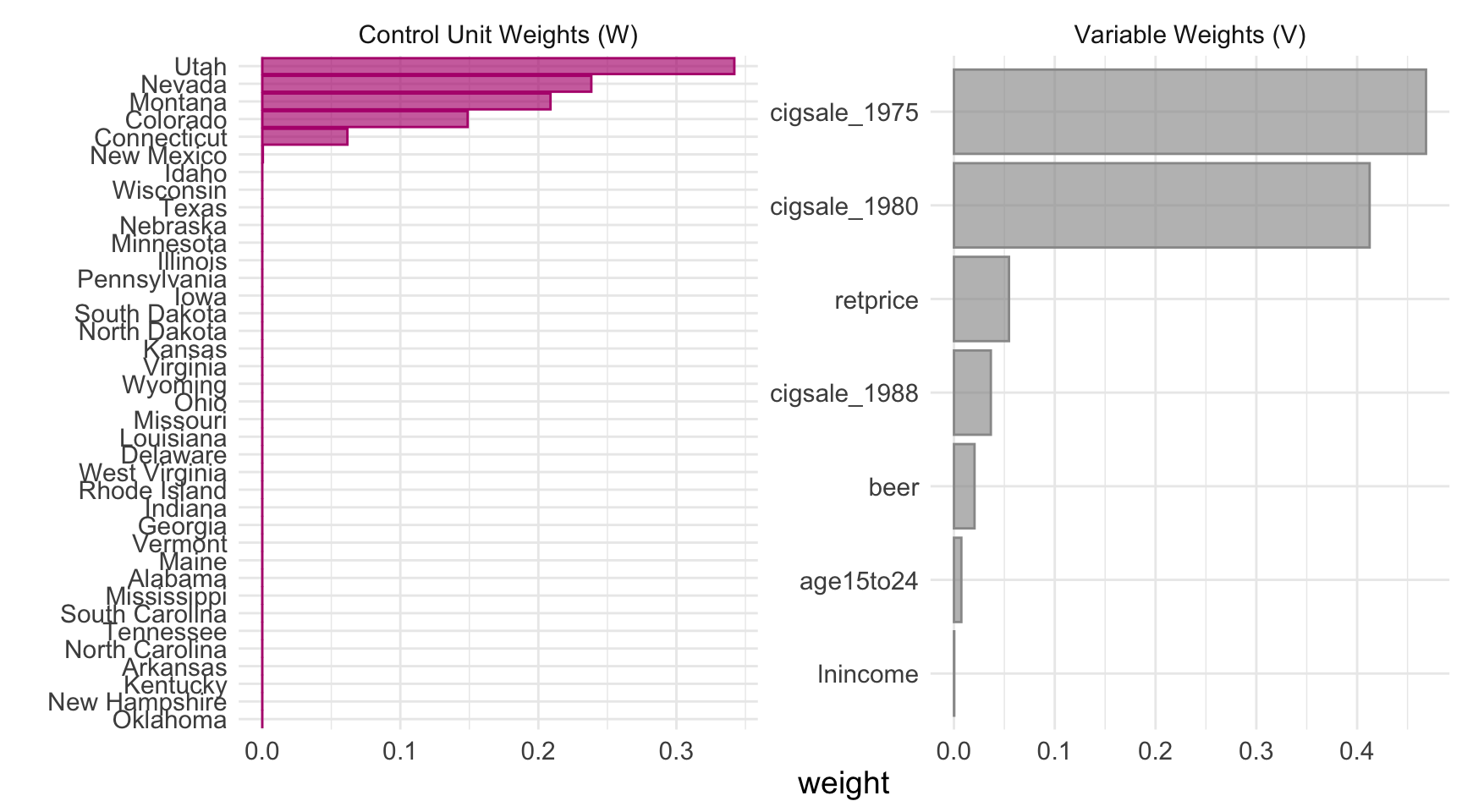
5.6.1 A closer look at the V matrix
The combined plot_weights() view is convenient, but the V matrix deserves a stand-alone chart because it answers a different question than the donor weights. Donor weights say which states mimic California; the V matrix says which variables the optimiser used to decide what “mimics” means.
Code
predw_df <- grab_predictor_weights(prop99_syn) |>
  mutate(variable = fct_reorder(variable, weight))

ggplot(predw_df, aes(x = weight, y = variable)) +
  geom_col(fill = "#6a9bcc") +
  geom_text(aes(label = sprintf("%.3f", weight)), hjust = -0.12) +
  scale_x_continuous(expand = expansion(mult = c(0, 0.15))) +
  labs(x = "V-matrix weight (predictor importance)", y = NULL) +
  theme_minimal()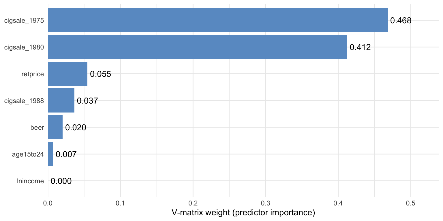
Two readings of the same picture, one practical and one cautionary.
- Practical reading. Two lagged outcomes (
cigsale_1975andcigsale_1980) carry the bulk of the matching information. The optimiser has decided that California’s pre-period cigarette sales — at multiple time points — are the best fingerprint to match. - Cautionary reading. The V matrix is not a causal ranking. It tells you which variables were useful for matching the treated unit’s pre-period, not which variables cause the outcome.
Common pitfall. Treating the V matrix as a list of causal drivers. It is a list of good pre-period predictors for one specific unit, not a structural model of smoking.
5.7 The estimate
Code
# grab_synthetic_control() returns a tidy tibble with observed (real_y)
# and synthetic (synth_y) cigsale for every year. We restrict to the
# post-period and compute the per-year gap.
sc_post <- grab_synthetic_control(prop99_syn) |>
  filter(time_unit > 1988) |>
  mutate(dif = real_y - synth_y)

# Average the per-year gap to recover the ATT.
mean(sc_post$dif)
[1] -18.84561The Synthetic Control ATT is approximately \(-18.85\) packs/capita averaged over 1989–2000. This is the book’s primary causal estimate and within rounding of the canonical Abadie et al. (2010) result.
Code
plot_trends(prop99_syn)Warning: Using `size` aesthetic for lines was deprecated in ggplot2 3.4.0.
ℹ Please use `linewidth` instead.
ℹ The deprecated feature was likely used in the tidysynth package.
Please report the issue to the authors.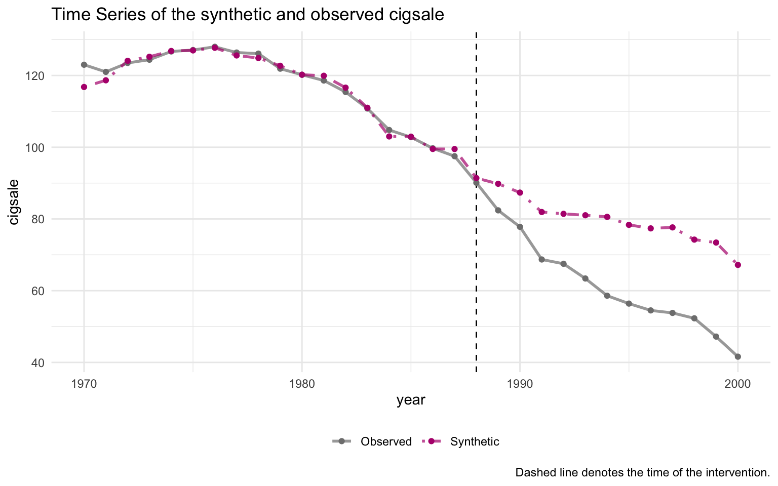
The pre-period fit is excellent — the synthetic and observed series are nearly indistinguishable through 1988. A substantial gap opens immediately after 1989, widening to roughly 30 packs by 2000.
5.8 Predictor balance: did the matching work?
grab_balance_table() shows California, synthetic California, and the unweighted donor average side-by-side on every predictor.
Code
grab_balance_table(prop99_syn) |>
gt_pretty(decimals = 2)| variable | California | synthetic_California | donor_sample |
|---|---|---|---|
| age15to24 | 0.17 | 0.17 | 0.17 |
| lnincome | 10.08 | 9.85 | 9.83 |
| retprice | 89.42 | 89.39 | 87.27 |
| beer | 24.28 | 24.22 | 23.66 |
| cigsale_1975 | 127.1 | 126.99 | 136.93 |
| cigsale_1980 | 120.2 | 120.22 | 138.09 |
| cigsale_1988 | 90.1 | 91.39 | 113.82 |
On every variable, synthetic California is far closer to California than the unweighted donor average is. The most dramatic improvement is on the lagged outcomes: cigsale_1988 is roughly 90 for California vs ≈91 for the synthetic — a near-perfect match — while the unweighted donor average is around 114. That gap of ~24 packs is exactly the bias the naive pre-post method silently absorbed.
5.9 Visualising the post-period gap
plot_trends() showed both observed and synthetic California on one canvas. The companion helper plot_differences() plots just the gap: \(Y_{1t} - \widehat{Y_{1t}(0)}\), year by year. This isolates the treatment-effect curve in its cleanest form.
Code
plot_differences(prop99_syn)Ignoring unknown labels:
• colour : ""
• linetype : ""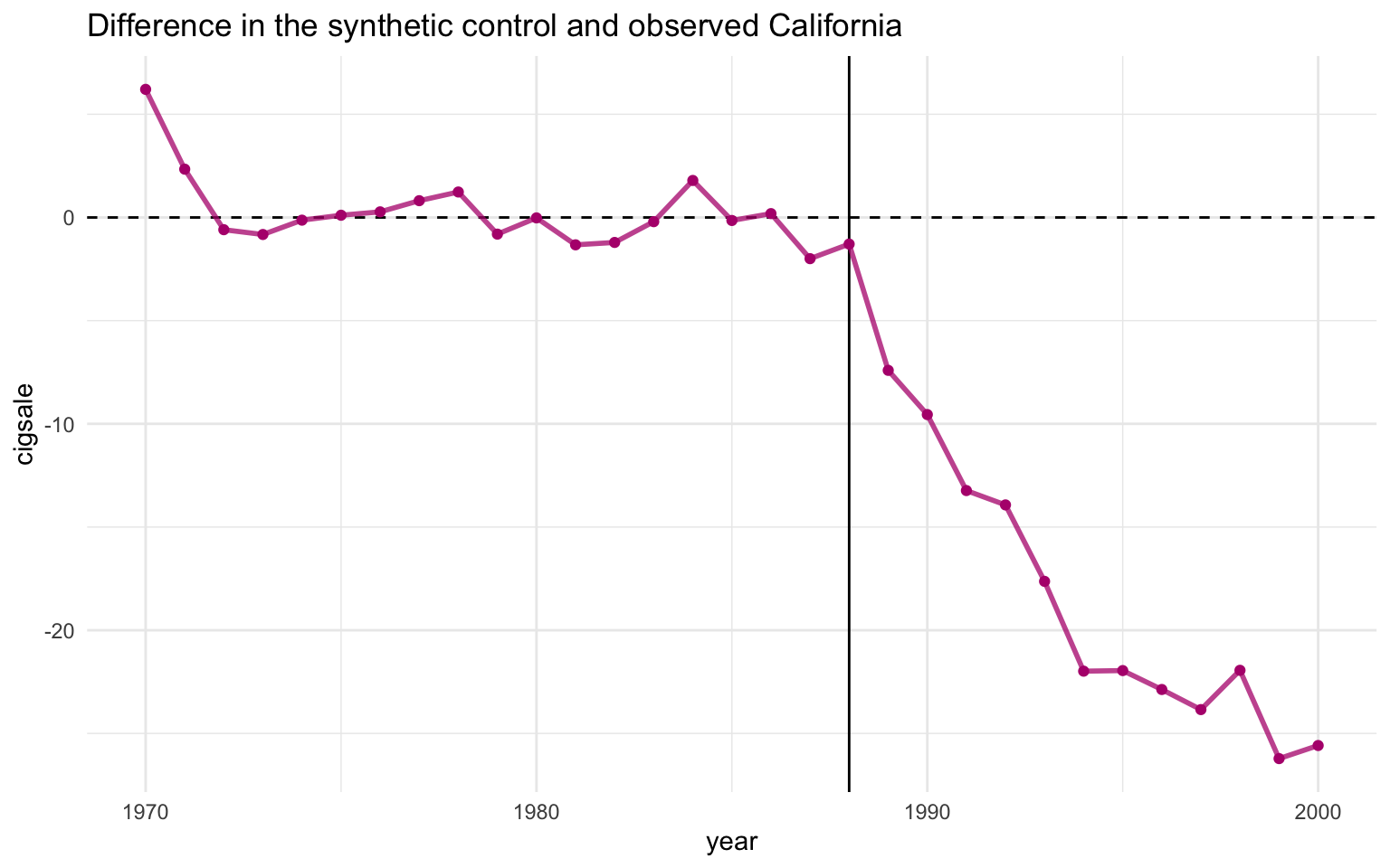
Read the line as the effect of Proposition 99 on California in year \(t\). The pre-period values hover near zero (the matching worked), the line drops sharply after 1989, and it stays negative — steadily widening — throughout the post-period. The 1989–2000 mean of this series is exactly the \(-18.85\) packs ATT reported above.
5.10 Inference via placebo permutation
A “standard error” computed as cross-year SD divided by \(\sqrt{N}\) is not a real sampling-distribution-based standard error. The proper Synthetic Control uncertainty quantification is a permutation test.
The recipe. Refit the synthetic-control model treating each donor state as if it had been the treated unit. Compute the post-period gap for each placebo. Compare California’s gap trajectory to those placebo trajectories. If California’s gap is extreme relative to the placebos, the policy probably did something.
Code
plot_placebos(prop99_syn)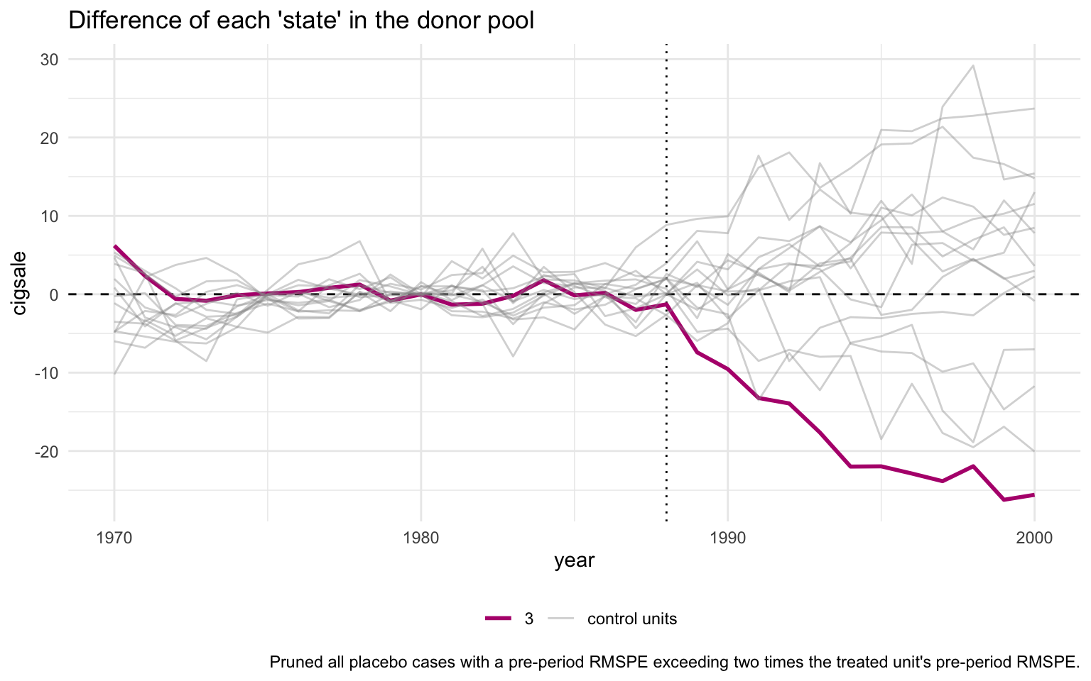
The orange line is California; the grey lines are the donor placebos. By default, plot_placebos() prunes placebos whose pre-period mean squared prediction error (MSPE) exceeds twice California’s — those donors fit their own pre-period so badly that comparing their post-period gap to California’s would be misleading. After pruning, California’s post-period gap sits visibly below every retained placebo, which is the visual signature of a “real” treatment effect.
The unpruned variant keeps every donor for full transparency:
Code
plot_placebos(prop99_syn, prune = FALSE)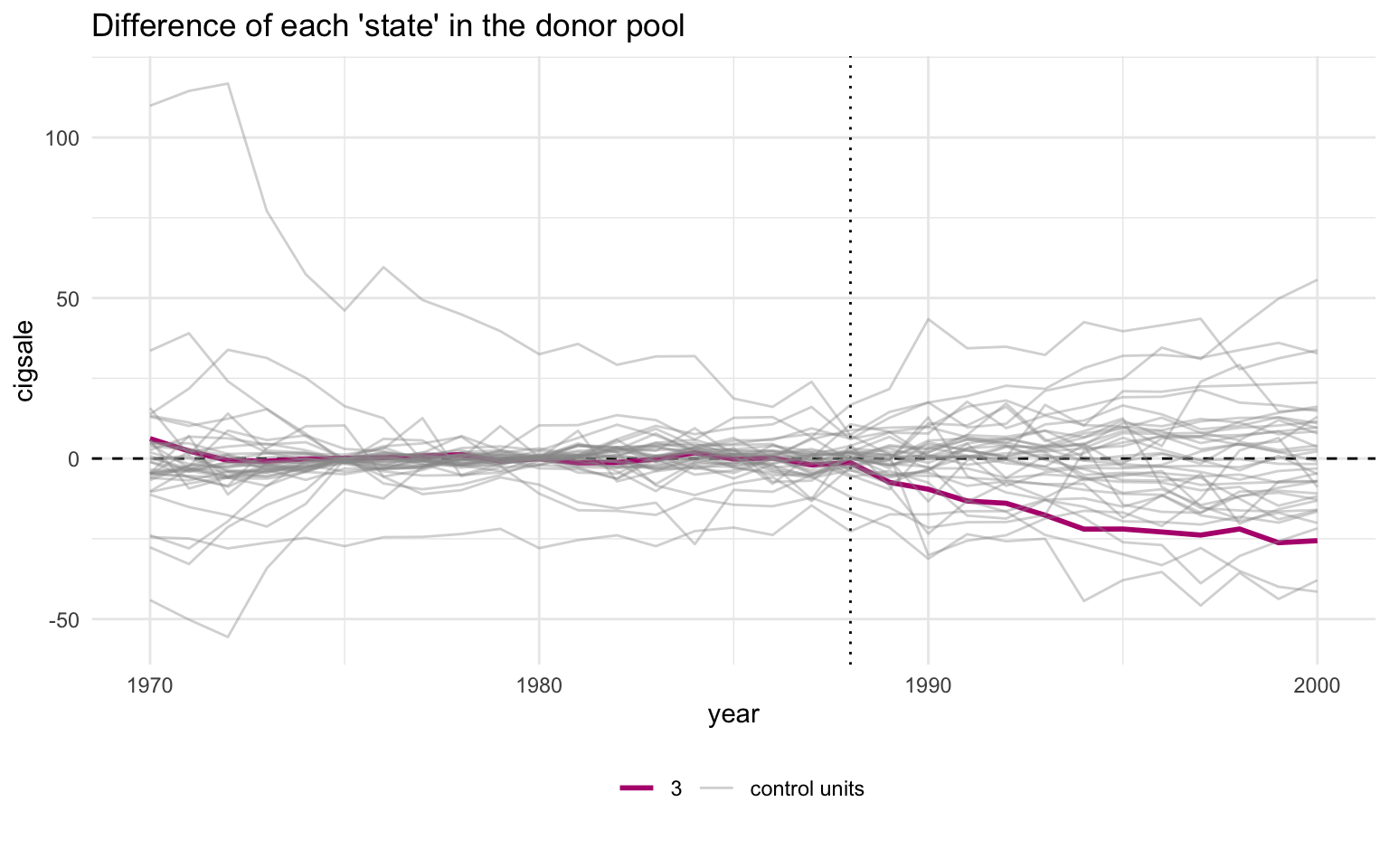
With pruning off, the grey cloud is messier and a few badly-fit donors swing wildly — but California’s post-period descent still ends up at the bottom of the bundle. The qualitative conclusion does not depend on the pruning rule.
5.11 MSPE ratio and Fisher exact p-value
A sharper version of the same test is the MSPE ratio — the ratio of post-period to pre-period mean squared prediction error. If a unit has a tight pre-period fit and a large post-period gap, the ratio is large.
Code
# grab_significance() returns one row per unit (treated + every placebo)
# with pre_mspe, post_mspe, the post/pre ratio, the unit's rank in that
# ratio, and the Fisher-style p-value (rank / n_units).
grab_significance(prop99_syn) |>
  arrange(desc(mspe_ratio)) |>
  head(5) |>
gt_pretty(decimals = 3)| unit_name | type | pre_mspe | post_mspe | mspe_ratio | rank | fishers_exact_pvalue | z_score |
|---|---|---|---|---|---|---|---|
| California | Treated | 3.166 | 392.198 | 123.87 | 1 | 0.026 | 5.324 |
| Georgia | Donor | 3.786 | 178.712 | 47.208 | 2 | 0.051 | 1.702 |
| Indiana | Donor | 25.171 | 769.656 | 30.577 | 3 | 0.077 | 0.916 |
| West Virginia | Donor | 9.523 | 284.105 | 29.832 | 4 | 0.103 | 0.881 |
| Wisconsin | Donor | 11.134 | 267.763 | 24.05 | 5 | 0.128 | 0.607 |
California’s MSPE ratio is around 124 — more than two and a half times higher than the next-highest unit. California ranks 1st out of 39 units. The Fisher exact \(p\)-value is rank divided by total units, so \(1/39 \approx 0.026\). Under the null hypothesis that Proposition 99 had no effect, the probability of seeing a unit this extreme purely by chance is about 2.6%.
Code
plot_mspe_ratio(prop99_syn)Ignoring unknown labels:
• colour : ""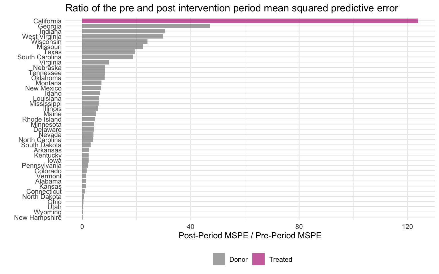
The orange bar at the top is California; every blue bar below it is a placebo donor. The gap between California and the second-place state is enormous. That gap is the visual signature of “a real treatment effect that the donor pool does not naturally replicate”.
5.12 Inspecting the nested tidysynth object
prop99_syn is not a plain data frame — it is a nested tibble with one row per unit (treated unit + every donor refit as a placebo) and list-columns that hold every intermediate output of the optimisation.
This one chunk prints with R’s default nested-tibble formatter on purpose — the <tibble [N × M]> glyphs in the list-columns are the pedagogical point that a styled table would hide.
Code
prop99_syn# A tibble: 78 × 11
.id .placebo .type .outcome .predictors .synthetic_control .unit_weights
<fct> <dbl> <chr> <list> <list> <list> <list>
1 Califor… 0 trea… <tibble> <tibble> <tibble [31 × 3]> <tibble>
2 Califor… 0 cont… <tibble> <tibble> <tibble [31 × 3]> <tibble>
3 Alabama 1 trea… <tibble> <tibble> <tibble [31 × 3]> <tibble>
4 Alabama 1 cont… <tibble> <tibble> <tibble [31 × 3]> <tibble>
5 Arkansas 1 trea… <tibble> <tibble> <tibble [31 × 3]> <tibble>
6 Arkansas 1 cont… <tibble> <tibble> <tibble [31 × 3]> <tibble>
7 Colorado 1 trea… <tibble> <tibble> <tibble [31 × 3]> <tibble>
8 Colorado 1 cont… <tibble> <tibble> <tibble [31 × 3]> <tibble>
9 Connect… 1 trea… <tibble> <tibble> <tibble [31 × 3]> <tibble>
10 Connect… 1 cont… <tibble> <tibble> <tibble [31 × 3]> <tibble>
# ℹ 68 more rows
# ℹ 4 more variables: .predictor_weights <list>, .original_data <list>,
# .meta <list>, .loss <list>Each list-column can be flattened with tidyr::unnest() for custom downstream work, or pulled out with one of the grab_*() helpers used above.
Code
# Flatten .outcome into a wide table: one row per (unit, year).
# The actual cigarette-sales column is named after each unit, so we
# select metadata + California's series for a clean preview.
prop99_syn |>
  tidyr::unnest(cols = c(.outcome)) |>
  select(.id, .placebo, .type, time_unit, California) |>
  head(8) |>
gt_pretty(decimals = 2).outcome (first 8 rows).
| .id | .placebo | .type | time_unit | California |
|---|---|---|---|---|
| California | 0 | treated | 1,970 | 123 |
| California | 0 | treated | 1,971 | 121 |
| California | 0 | treated | 1,972 | 123.5 |
| California | 0 | treated | 1,973 | 124.4 |
| California | 0 | treated | 1,974 | 126.7 |
| California | 0 | treated | 1,975 | 127.1 |
| California | 0 | treated | 1,976 | 128 |
| California | 0 | treated | 1,977 | 126.4 |
For the tidy observed-vs-synthetic table (which is what most analyses want), the dedicated helper is more convenient:
Code
grab_synthetic_control(prop99_syn) |>
  head(8) |>
gt_pretty(decimals = 2)grab_synthetic_control() — observed vs synthetic (first 8 rows).
| time_unit | real_y | synth_y |
|---|---|---|
| 1,970 | 123 | 116.79 |
| 1,971 | 121 | 118.66 |
| 1,972 | 123.5 | 124.09 |
| 1,973 | 124.4 | 125.23 |
| 1,974 | 126.7 | 126.83 |
| 1,975 | 127.1 | 126.99 |
| 1,976 | 128 | 127.73 |
| 1,977 | 126.4 | 125.59 |
This is the whole point of the nested-tibble design: every step of the optimisation is introspectable from R, with no need to dig into S4 slots or attr() blobs.
5.13 Recap
| Question | Answer |
|---|---|
| What does Synthetic Control estimate? | The ATT on California, 1989–2000 |
| What is the point estimate? | \(-18.85\) packs/capita per year |
| What is “synthetic California”? | A convex combination of five Western/sunbelt states (Utah, Nevada, Montana, Colorado, Connecticut) |
| What predictors did the matching? | Mostly two lagged outcomes — cigsale_1975 and cigsale_1980 |
| How is the matching quality? | Excellent — synthetic and observed California are near-identical through 1988 |
| What is the inference statistic? | Fisher exact \(p \approx 0.026\) (California ranks 1st out of 39 on the MSPE ratio) |
| What is the design-time pitfall? | Don’t read the V matrix as a list of causal drivers — it is a list of good pre-period predictors |
Synthetic Control is the book’s headline causal estimate, and the placebo / MSPE-ratio diagnostics both confirm that California’s post-1989 trajectory is unusual relative to what other states experienced in the same window. In chapter 6 we hand the same donor information to a Bayesian model and ask whether a credible interval (a direct probability statement about the effect) tells the same story.