---
title: 5. Bivariate Data Summary
execute:
enabled: true
warning: false
---
**metricsAI: An Introduction to Econometrics with Python and AI in the Cloud**
*[Carlos Mendez](https://carlos-mendez.org)*
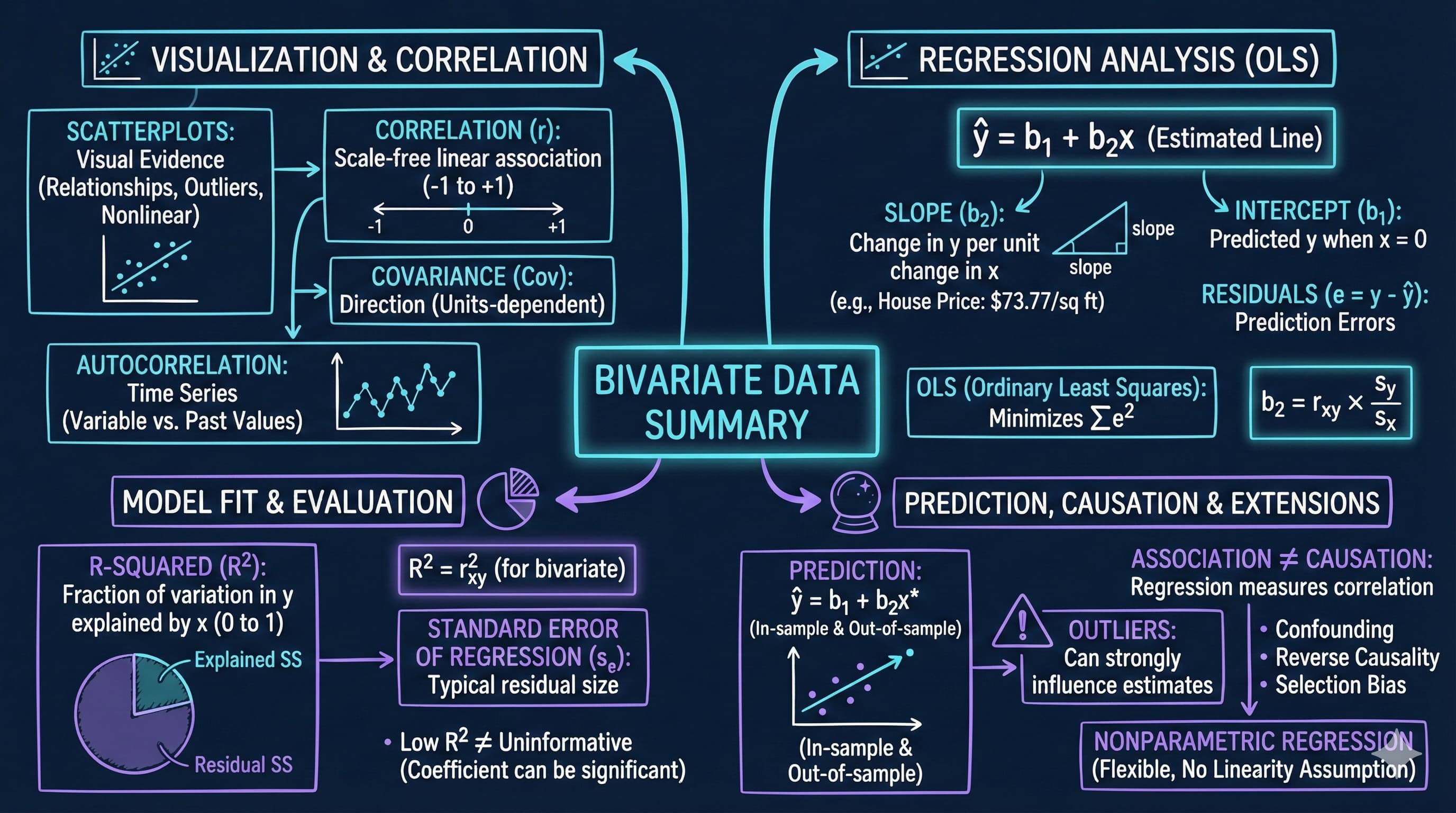
<img src="https://raw.githubusercontent.com/quarcs-lab/metricsai/main/images/ch05_visual_summary.jpg" alt="Chapter 05 Visual Summary" width="100%">
This notebook provides an interactive introduction to bivariate data analysis and simple linear regression using Python. You'll learn how to summarize relationships between two variables using correlation, scatter plots, and regression analysis. All code runs directly in Google Colab without any local setup.
[](https://colab.research.google.com/github/quarcs-lab/metricsai/blob/main/notebooks_colab/ch05_Bivariate_Data_Summary.ipynb)
<div class="chapter-resources">
<a href="https://www.youtube.com/watch?v=sVT1KfjoZQg" target="_blank" class="resource-btn">🎬 AI Video</a>
<a href="https://carlos-mendez.my.canva.site/s05-bivariate-data-summary-pdf" target="_blank" class="resource-btn">✨ AI Slides</a>
<a href="https://cameron.econ.ucdavis.edu/aed/traedv1_05" target="_blank" class="resource-btn">📊 Cameron Slides</a>
<a href="https://app.edcafe.ai/quizzes/697865de2f5d08069e0482cc" target="_blank" class="resource-btn">✏️ Quiz</a>
<a href="https://app.edcafe.ai/chatbots/69789e4c2f5d08069e0704c6" target="_blank" class="resource-btn">🤖 AI Tutor</a>
</div>
## Chapter Overview
**Bivariate data** involves observations on two variables—for example, house prices and house sizes, or income and education. This chapter teaches you how to summarize and analyze relationships between two variables using correlation and regression.
**What you'll learn:**
- Summarize bivariate relationships using two-way tabulations and scatterplots
- Calculate and interpret correlation coefficients and understand their relationship to covariance
- Estimate and interpret regression lines using ordinary least squares (OLS)
- Evaluate model fit using R-squared, standard error, and variation decomposition
- Make predictions and identify outliers in regression analysis
- Understand the critical distinction between association and causation
- Apply nonparametric regression methods to check linearity assumptions
**Dataset used:**
- **AED_HOUSE.DTA**: House prices and characteristics for 29 houses sold in Central Davis, California in 1999 (price, size, bedrooms, bathrooms, lot size, age)
**Chapter outline:**
- 5.1 Example - House Price and Size
- 5.2 Two-Way Tabulation
- 5.3 Two-Way Scatter Plot
- 5.4 Sample Correlation
- 5.5 Regression Line
- 5.6 Measures of Model Fit
- 5.7 Computer Output Following Regression
- 5.8 Prediction and Outliers
- 5.9 Regression and Correlation
- 5.10 Causation
- 5.11 Nonparametric Regression
## Key Concepts
Seven core ideas anchor this chapter. Skim them before you start, and come back when a term feels fuzzy. Each entry pairs a concrete example using the chapter's data with a non-technical analogy. Click a panel to expand it.
**Covariance:** A signed measure of how two variables move together. Positive covariance means above-average values of one tend to coincide with above-average values of the other; negative covariance means they move in opposite directions. Unlike correlation, covariance carries the units of both variables and has no fixed bounds.
::::: {.columns}
:::: {.column width="50%"}
::: {.callout-tip collapse="true" appearance="simple" title="Example"}
For the 29 Davis houses, the sample covariance between `price` and `size` is positive — large enough that dividing it by the product of the two standard deviations ($s_x \approx 398$ sq ft, $s_y \approx \$37{,}391$) yields the correlation $r = 0.7858$. The covariance carries dollars × square-feet units, which is why correlation (unit-free) is easier to interpret across datasets.
:::
::::
:::: {.column width="50%"}
::: {.callout-note collapse="true" appearance="simple" title="Analogy"}
Two dancers in a partner waltz move together: when one steps forward the other tends to step forward too. Covariance is a yardstick for how often, and how strongly, the partners' steps line up. Same direction and timing ⇒ large positive covariance; opposite footing ⇒ negative; no relationship ⇒ near zero.
:::
::::
:::::
**Slope Coefficient ($b_2$):** The regression coefficient on the explanatory variable. It tells you the predicted change in $y$ for a one-unit change in $x$, holding the model's other terms fixed. Its units are the units of $y$ per unit of $x$.
::::: {.columns}
:::: {.column width="50%"}
::: {.callout-tip collapse="true" appearance="simple" title="Example"}
The fitted line $\widehat{\text{price}} = 115{,}017 + 73.77 \cdot \text{size}$ has slope $b_2 = \$73.77$ per square foot. So a house 100 sq ft larger is predicted to cost \$7,377 more, and one 500 sq ft larger \$36,885 more. The 95% confidence interval [\$50.84, \$96.70] tells you the slope is precisely estimated enough to rule out near-zero values.
:::
::::
:::: {.column width="50%"}
::: {.callout-note collapse="true" appearance="simple" title="Analogy"}
A slope is the steepness of a hill: rise per unit of run. Walking 100 steps east on a 5° slope gains you a known amount of elevation; on a steeper 15° slope you gain three times as much. The regression slope is the hill's steepness translated into the chosen $y$-units per $x$-unit.
:::
::::
:::::
**Intercept ($b_1$):** The point where the regression line crosses the $y$-axis — the predicted value of $y$ when $x = 0$. It anchors the line vertically but is often not meaningful on its own when $x = 0$ lies far outside the observed data.
::::: {.columns}
:::: {.column width="50%"}
::: {.callout-tip collapse="true" appearance="simple" title="Example"}
For the Davis houses the intercept is $b_1 = \$115{,}017$ — mathematically, the predicted price of a 0-square-foot house. Since the smallest observed `size` is 1,400 sq ft, this number is not literally meaningful; it is just where the fitted line happens to cross the $y$-axis to make the slope of \$73.77/sq ft fit the data.
:::
::::
:::: {.column width="50%"}
::: {.callout-note collapse="true" appearance="simple" title="Analogy"}
The intercept is the starting line of a race — the position runners occupy at $t = 0$, before any racing has happened. It tells you nothing about how fast they run (that's the slope); it only fixes where the race begins. In regression, the intercept fixes where the line begins; the slope governs everything after.
:::
::::
:::::
**Residual ($e_i$):** The vertical distance between an observed point and the fitted regression line — the part of $y_i$ the model fails to predict. Formally, $e_i = y_i - \hat{y}_i$. OLS chooses the line that makes the sum of squared residuals as small as possible.
::::: {.columns}
:::: {.column width="50%"}
::: {.callout-tip collapse="true" appearance="simple" title="Example"}
For the Davis house regression, the typical residual size is about \$23{,}551 — that is the standard error of the regression. So when the fitted line predicts a 2,000-sq-ft home at \$262,559, an actual house of that size could comfortably sell for anywhere from roughly \$240k to \$285k once unmodelled factors (location, condition, view) are considered.
:::
::::
:::: {.column width="50%"}
::: {.callout-note collapse="true" appearance="simple" title="Analogy"}
A residual is the gap between where your arrow lands and the centre of the bullseye on a target. The line of best fit is the bullseye the regression is aiming at; each shot lands a little high or low, but the cumulative pattern of misses is what tells you whether the bow itself is biased or just noisy.
:::
::::
:::::
**Variation Decomposition (TSS = ESS + RSS):** A foundational identity stating that the total variation in $y$ around its mean splits cleanly into a part the regression *explains* (ESS) and a part it leaves over as *residual* (RSS). $R^2$ is the explained share, $\text{ESS}/\text{TSS}$.
::::: {.columns}
:::: {.column width="50%"}
::: {.callout-tip collapse="true" appearance="simple" title="Example"}
For the 29 Davis houses, the regression on `size` explains 61.7% of the variation in `price`, leaving 38.3% in the residual sum of squares. So out of the total spread in observed prices (a range of \$171{,}000 between cheapest and dearest), nearly two-thirds is captured by size alone, while the remaining third reflects location, condition, and other unmodelled features.
:::
::::
:::: {.column width="50%"}
::: {.callout-note collapse="true" appearance="simple" title="Analogy"}
Picture a pie representing all the variation in the outcome. The regression cuts the pie into two slices: the explained slice (what we can attribute to the predictor) and the unexplained slice (what remains). $R^2$ measures the size of the explained slice as a fraction of the whole pie — and the two slices always add up to 100%.
:::
::::
:::::
**Standard Error of the Regression ($s_e$):** The typical size of the residuals — the standard deviation of the prediction errors, in the units of $y$. It quantifies how far, on average, fitted values stray from observed values, after the line has been chosen.
::::: {.columns}
:::: {.column width="50%"}
::: {.callout-tip collapse="true" appearance="simple" title="Example"}
For the Davis house regression, $s_e = \$23{,}551$ — about 9% of the average sale price (\$253{,}910). So even though the model captures the main pattern via $R^2 = 0.62$, individual price predictions should be reported with an error band of roughly $\pm \$23{,}000$, reminding the analyst not to over-trust a single point estimate.
:::
::::
:::: {.column width="50%"}
::: {.callout-note collapse="true" appearance="simple" title="Analogy"}
A weather app predicts tomorrow's high at 22 °C — but its track record shows forecasts typically miss by ±2 °C. That ±2 °C is the standard error of the forecast: not which way the error will go, but how big it usually is. The standard error of the regression is the same idea applied to predicted $y$-values.
:::
::::
:::::
**Outlier:** An observation that sits far from the bulk of the data, especially far from the regression line. Outliers can pull the fitted slope toward themselves and inflate the standard error, so they need to be flagged and investigated rather than blindly included or excluded.
::::: {.columns}
:::: {.column width="50%"}
::: {.callout-tip collapse="true" appearance="simple" title="Example"}
The Davis scatterplot of `price` vs. `size` shows no obvious outliers — every point fits the upward-sloping cloud. To see why this matters, imagine inserting a 3,300-sq-ft mansion priced at only \$210{,}000 (perhaps a fixer-upper): one such point would shrink the slope from \$73.77 toward something noticeably smaller, and the typical residual would jump well above \$23,551.
:::
::::
:::: {.column width="50%"}
::: {.callout-note collapse="true" appearance="simple" title="Analogy"}
A flock of geese flies in a tight V-formation; one bird lagging far behind is the outlier. It might be injured, lost, or a different species entirely — and either way, judging the flock's average altitude or speed by including the straggler will mislead you. Outliers in regression are the stragglers worth identifying before you publish the average.
:::
::::
:::::
## Setup
First, we import the necessary Python packages and configure the environment for reproducibility. All data will stream directly from GitHub.
```{python}
#| code-fold: true
#| code-summary: "Setup: Import libraries and configure environment"
# --- Libraries ---
import numpy as np                                          # numerical operations
import pandas as pd                                         # data manipulation
import matplotlib.pyplot as plt                             # plotting
import seaborn as sns                                       # statistical visualization
import pyfixest as pf                                       # fast OLS regression
from statsmodels.nonparametric.smoothers_lowess import lowess  # LOWESS smoothing
from scipy import stats                                     # statistical distributions
from scipy.ndimage import gaussian_filter1d                 # kernel smoothing
import random
import os

# --- Reproducibility ---
RANDOM_SEED = 42
random.seed(RANDOM_SEED)
np.random.seed(RANDOM_SEED)
os.environ['PYTHONHASHSEED'] = str(RANDOM_SEED)

# --- Data source ---
GITHUB_DATA_URL = "https://raw.githubusercontent.com/quarcs-lab/data-open/master/AED/"

# --- Plotting style ---
plt.style.use('dark_background')
sns.set_style("darkgrid")
plt.rcParams.update({
    'axes.facecolor': '#1a2235',
    'figure.facecolor': '#12162c',
    'grid.color': '#3a4a6b',
    'figure.figsize': (10, 6),
    'text.color': 'white',
    'axes.labelcolor': 'white',
    'xtick.color': 'white',
    'ytick.color': 'white',
    'axes.edgecolor': '#1a2235',
})

print("Setup complete! Ready to explore bivariate data analysis.")
```
## 5.1 Example - House Price and Size
We begin by loading and examining data on house prices and sizes from 29 houses sold in Central Davis, California in 1999. This dataset will serve as our main example throughout the chapter.
**Why this dataset?**
- Small enough to see individual observations
- Large enough to demonstrate statistical relationships
- Economically meaningful: housing is a major component of wealth
- Clear relationship: larger houses tend to cost more
```{python}
# Load the house data
data_house = pd.read_stata(GITHUB_DATA_URL + 'AED_HOUSE.DTA')

print("Data loaded successfully!")
print(f"Number of observations: {len(data_house)}")
print(f"Number of variables: {data_house.shape[1]}")
print(f"\nVariables: {', '.join(data_house.columns.tolist())}")
```
With only 29 observations we can inspect the complete dataset — a rare luxury. As you scan the rows, notice informally whether houses with larger `size` values also tend to have higher `price` values.
```{python}
# Table 5.1: Complete dataset
data_house
```
Before analyzing the two variables jointly, we summarize each one separately. Keep an eye on the means and standard deviations of `price` and `size` — these univariate ingredients reappear later in the correlation and slope formulas.
```{python}
# Table 5.2: Summary statistics
display(data_house[['price', 'size']].describe())

# Extract key variables
price = data_house['price']
size = data_house['size']

print("\nPrice Statistics:")
print(f"  Mean:      ${price.mean():,.2f}")
print(f"  Median:    ${price.median():,.2f}")
print(f"  Min:       ${price.min():,.2f}")
print(f"  Max:       ${price.max():,.2f}")
print(f"  Std Dev:   ${price.std():,.2f}")

print("\nSize Statistics:")
print(f"  Mean:      {size.mean():,.0f} sq ft")
print(f"  Median:    {size.median():,.0f} sq ft")
print(f"  Min:       {size.min():,.0f} sq ft")
print(f"  Max:       {size.max():,.0f} sq ft")
print(f"  Std Dev:   {size.std():,.0f} sq ft")
```
> **Key Concept 5.1: Summary Statistics for Bivariate Data**
>
> Summary statistics describe the center, spread, and range of each variable before examining their relationship. For bivariate analysis, compute the mean, median, standard deviation, minimum, and maximum of both variables. Comparing means and medians reveals skewness; standard deviations indicate variability. These univariate summaries provide essential context for interpreting correlation and regression results.
**What do these numbers tell us about the Davis housing market (1999)?**
**Price Statistics:**
- **Mean = \$253,910**: Average house price in the sample
- **Median = \$244,000**: Middle value (half above, half below)
- **Range**: \$204,000 to \$375,000 (spread of \$171,000)
- **Std Dev = \$37,391**: Typical deviation from the mean
**Size Statistics:**
- **Mean = 1,883 sq ft**: Average house size
- **Median = 1,800 sq ft**: Middle value
- **Range**: 1,400 to 3,300 sq ft (spread of 1,900 sq ft)
- **Std Dev = 398 sq ft**: Typical deviation from the mean
**Key insights:**
- Both distributions are fairly symmetric (means close to medians)
- Substantial variation in both price and size (good for regression!)
- The price coefficient of variation (CV = 0.15) and size CV (0.21) show moderate variability
- **Moving from univariate to bivariate**: In Chapter 2, we looked at single variables. Now we ask: *how do these two variables move together?*
**Economic context:** These are moderate-sized homes in a California college town (UC Davis), with typical prices for the late 1990s.
## 5.2 Two-Way Tabulation
A **two-way tabulation** (or crosstabulation) shows how observations are distributed across combinations of two categorical variables. For continuous variables like price and size, we first create categorical ranges.
**Why use tabulation?**
- Provides a quick summary of the relationship
- Useful for discrete or categorical data
- Can reveal patterns before formal analysis
```{python}
# Create categorical variables
price_range = pd.cut(price, bins=[0, 249999, np.inf],
                     labels=['< $250,000', '≥ $250,000'])

size_range = pd.cut(size, bins=[0, 1799, 2399, np.inf],
                    labels=['< 1,800', '1,800-2,399', '≥ 2,400'])

# Two-way tabulation of price and size
crosstab = pd.crosstab(price_range, size_range, margins=True)
crosstab
```
**What to look for:** 11 houses are both low-priced and small; 0 houses are both low-priced and large (>= 2,400 sq ft); 3 houses are both high-priced and large. The pattern suggests positive association: larger houses tend to be more expensive.
> **Key Concept 5.2: Two-Way Tabulations**
>
> Two-way tabulations show the joint distribution of two categorical variables. Expected frequencies (calculated assuming independence) provide the basis for Pearson's chi-squared test of statistical independence. The crosstabulation reveals patterns: no low-priced large houses suggests a positive association between size and price.
**What does this crosstab tell us?**
Looking at the table:
- **11 houses** are both small (< 1,800 sq ft) AND low-priced (< \$250,000)
- **0 houses** are both large (≥ 2,400 sq ft) AND low-priced
- **3 houses** are both large (≥ 2,400 sq ft) AND high-priced (≥ \$250,000)
- **6 houses** are medium-sized (1,800-2,399 sq ft) AND low-priced
**The pattern reveals:**
- **Positive association**: Most observations cluster in the "small and cheap" or "large and expensive" cells
- **No counterexamples**: We never see "large and cheap" houses (the ≥ 2,400 sq ft, < \$250,000 cell is empty)
- **Imperfect relationship**: Some medium-sized houses are low-priced (6 houses), some are high-priced (7 houses)
**From Categorical to Continuous:**
Crosstabulation is useful but has limitations:
- **Information loss**: We convert continuous data (exact prices/sizes) into categories
- **Arbitrary bins**: Results can change depending on where we draw category boundaries
- **No precise measurement**: Can't quantify exact strength of relationship
**Solution**: Use the full continuous data with **correlation** and **regression** to:
- Preserve all information in the original measurements
- Get precise, interpretable measures (r, slope)
- Make specific predictions for any value of x
## 5.3 Two-Way Scatter Plot
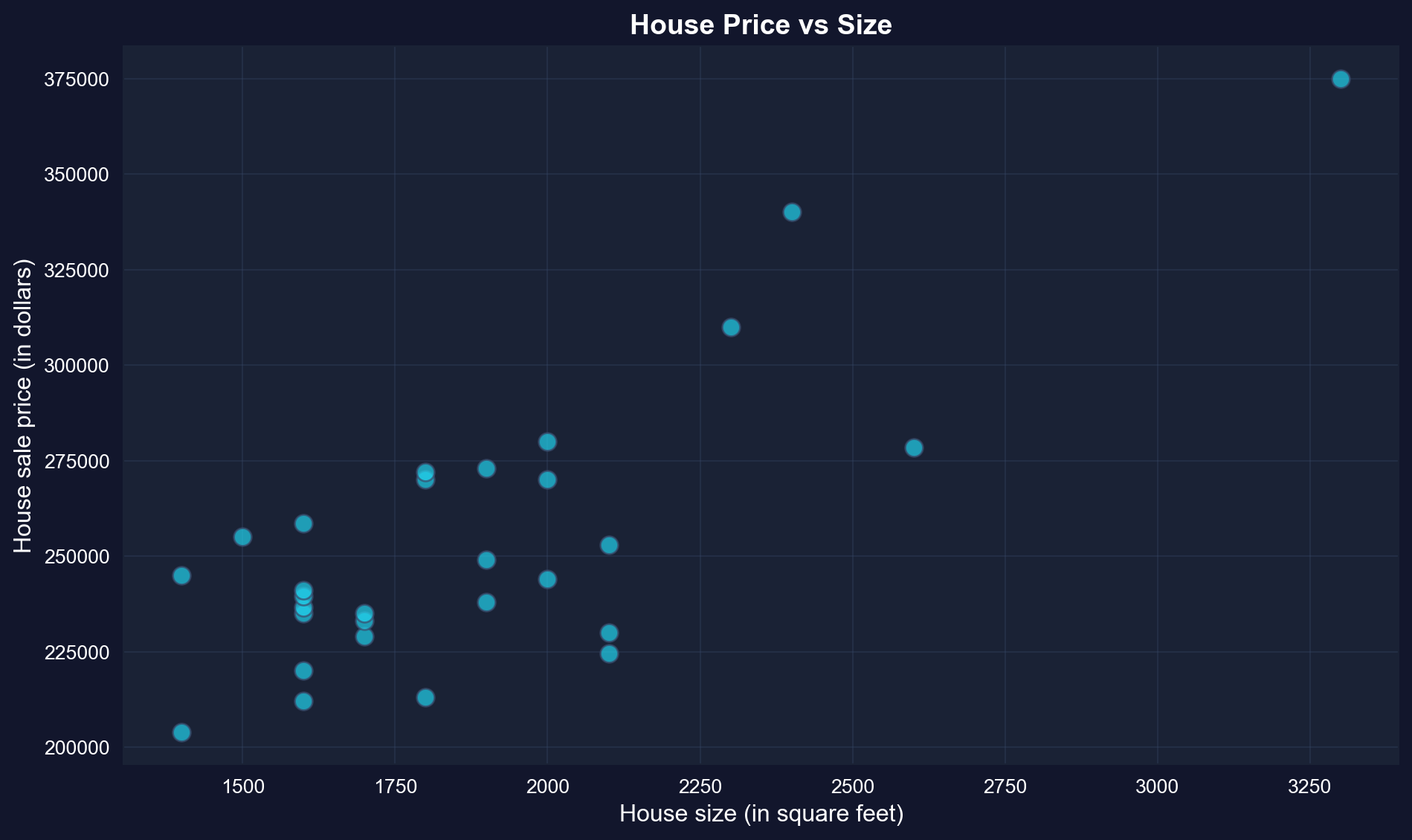
A **scatter plot** is the primary visual tool for examining the relationship between two continuous variables. Each point represents one observation, with x-coordinate showing size and y-coordinate showing price.
**What to look for:**
- **Direction:** Does y increase or decrease as x increases?
- **Strength:** How closely do points follow a pattern?
- **Form:** Is the relationship linear or curved?
- **Outliers:** Are there unusual observations far from the pattern?
```{python}
# Scatter plot of price vs size
fig, ax = plt.subplots(figsize=(10, 6))
ax.scatter(size, price, s=80, alpha=0.7, color='#22d3ee', edgecolor='#3a4a6b')  # s = marker size, alpha = transparency
ax.set_xlabel('House size (in square feet)', fontsize=12)
ax.set_ylabel('House sale price (in dollars)', fontsize=12)
ax.set_title('House Price vs Size', fontsize=14, fontweight='bold')
ax.grid(True, alpha=0.3)
plt.tight_layout()
plt.show()
```
**What to look for in this scatter plot:**
- **Direction**: Positive -- larger houses tend to have higher prices
- **Form**: Roughly linear -- points follow an upward-sloping pattern
- **Scatter**: Moderate -- not all points lie exactly on a line
- **Outliers**: None obvious -- all points fit the general pattern
> **Key Concept 5.3: Scatterplots and Relationships**
>
> Scatterplots provide visual evidence of relationships between two continuous variables. They reveal the direction (positive/negative), strength (tight/loose clustering), form (linear/curved), and outliers of the relationship. The house price-size scatterplot shows a strong, positive, roughly linear relationship with no obvious outliers.
**Visual vs. Quantitative Analysis:**
The scatter plot provides **qualitative** insight (direction, form, outliers), but we need **quantitative** measures to:
- **Communicate precisely**: "Strong positive relationship" is vague; "r = 0.79" is specific
- **Compare across studies**: Can't compare scatter plots directly across datasets
- **Test hypotheses**: Need numerical values for statistical inference (Chapter 7)
- **Make predictions**: Visual estimates from graphs are imprecise
**Next**: We'll quantify this relationship using the correlation coefficient.
**What patterns do we observe?**
**1. Direction: Positive relationship**
- As house size increases (moving right), house price increases (moving up)
- This makes economic sense: bigger houses should cost more
**2. Form: Roughly linear**
- Points follow an upward-sloping pattern
- No obvious curvature (e.g., not exponential or U-shaped)
- A straight line appears to be a reasonable summary
**3. Strength: Moderate to strong**
- Points cluster fairly closely around an imaginary line
- Not perfect (some scatter), but clear pattern visible
- We'll quantify this with the correlation coefficient
**4. Outliers: None obvious**
- No houses wildly far from the general pattern
- All observations seem consistent with the relationship
**Comparison to univariate analysis (Chapter 2):**
- **Univariate**: Histogram shows distribution of one variable
- **Bivariate**: Scatter plot shows *relationship* between two variables
- **New question**: How does Y change when X changes?
**What we can't tell from the graph alone:**
- Exact strength of relationship (need correlation)
- Precise prediction equation (need regression)
- Statistical significance (need inference, Chapter 7)
## 5.4 Sample Correlation
The **correlation coefficient** $r$ is a unit-free measure of linear association between two variables. It ranges from -1 to 1:
- $r = 1$: Perfect positive linear relationship
- $0 < r < 1$: Positive linear relationship
- $r = 0$: No linear relationship
- $-1 < r < 0$: Negative linear relationship
- $r = -1$: Perfect negative linear relationship
**Formula:**
$$r_{xy} = \frac{\sum_{i=1}^{n}(x_i - \bar{x})(y_i - \bar{y})}{\sqrt{\sum_{i=1}^{n}(x_i - \bar{x})^2 \times \sum_{i=1}^{n}(y_i - \bar{y})^2}} = \frac{s_{xy}}{s_x s_y}$$
where $s_{xy}$ is the sample covariance, and $s_x$, $s_y$ are sample standard deviations.
**Key Properties of Correlation:**
Understanding these properties helps avoid common misinterpretations:
1. **Unit-free**: r = 0.79 whether we measure price in dollars, thousands, or millions
2. **Bounded**: Always between -1 and +1 (unlike covariance, which is unbounded)
3. **Symmetric**: r(price, size) = r(size, price) — order doesn't matter
4. **Only measures linear relationships**: Can miss curved, U-shaped, or other nonlinear patterns
5. **Sensitive to outliers**: One extreme point can dramatically change r
**Limitation**: Correlation is a summary measure but doesn't provide predictions. For that, we need **regression**.
```{python}
# Compute correlation and covariance
cov_matrix = data_house[['price', 'size']].cov()
corr_matrix = data_house[['price', 'size']].corr()

# Covariance and correlation

# Covariance matrix
display(cov_matrix)

# Correlation matrix
display(corr_matrix)

r = corr_matrix.loc['price', 'size']
print(f"\nCorrelation coefficient: r = {r:.4f}")
print(f"\nInterpretation:")
print(f"  The correlation of {r:.4f} indicates a strong positive linear")
print(f"  relationship between house price and size.")
print(f"  About {r**2:.1%} of the variation in price is linearly associated")
print(f"  with variation in size.")
```
> **Key Concept 5.4: The Correlation Coefficient**
>
> The correlation coefficient (r) is a scale-free measure of linear association ranging from -1 (perfect negative) to +1 (perfect positive). A correlation of 0 indicates no linear relationship. For house price and size, r = 0.786 indicates strong positive correlation. The correlation is unit-free, symmetric, and measures only linear relationships.
**What does r = 0.7858 mean?**
**1. Strength of linear association:**
- **r = 0.7858** indicates a **strong positive** linear relationship
- Scale reference:
- |r| < 0.3: weak
- 0.3 ≤ |r| < 0.7: moderate
- |r| ≥ 0.7: strong
- Our value (0.79) is well into the "strong" range
**2. Direction:**
- **Positive**: Larger houses are associated with higher prices
- If r were negative, larger houses would be associated with lower prices (unlikely for housing!)
**3. Variance explained (preview):**
- r² = (0.7858)² = 0.617 = **61.7%**
- About 62% of price variation is linearly associated with size variation
- The remaining 38% is due to other factors (location, age, condition, etc.)
**4. Properties of correlation:**
- **Unit-free**: Same value whether we measure price in dollars or thousands of dollars
- **Symmetric**: r(price, size) = r(size, price) = 0.7858
- **Bounded**: Always between -1 and +1
- **Linear measure**: Detects linear relationships, not curves
**Comparison to Chapter 2 (univariate):**
- Chapter 2: Standard deviation measures spread of ONE variable
- Chapter 5: Correlation measures how TWO variables move together
- Both are standardized measures (unit-free)
**Economic interpretation:** The strong correlation confirms what we saw in the scatter plot: house size is a strong predictor of house price, but it's not the only factor.
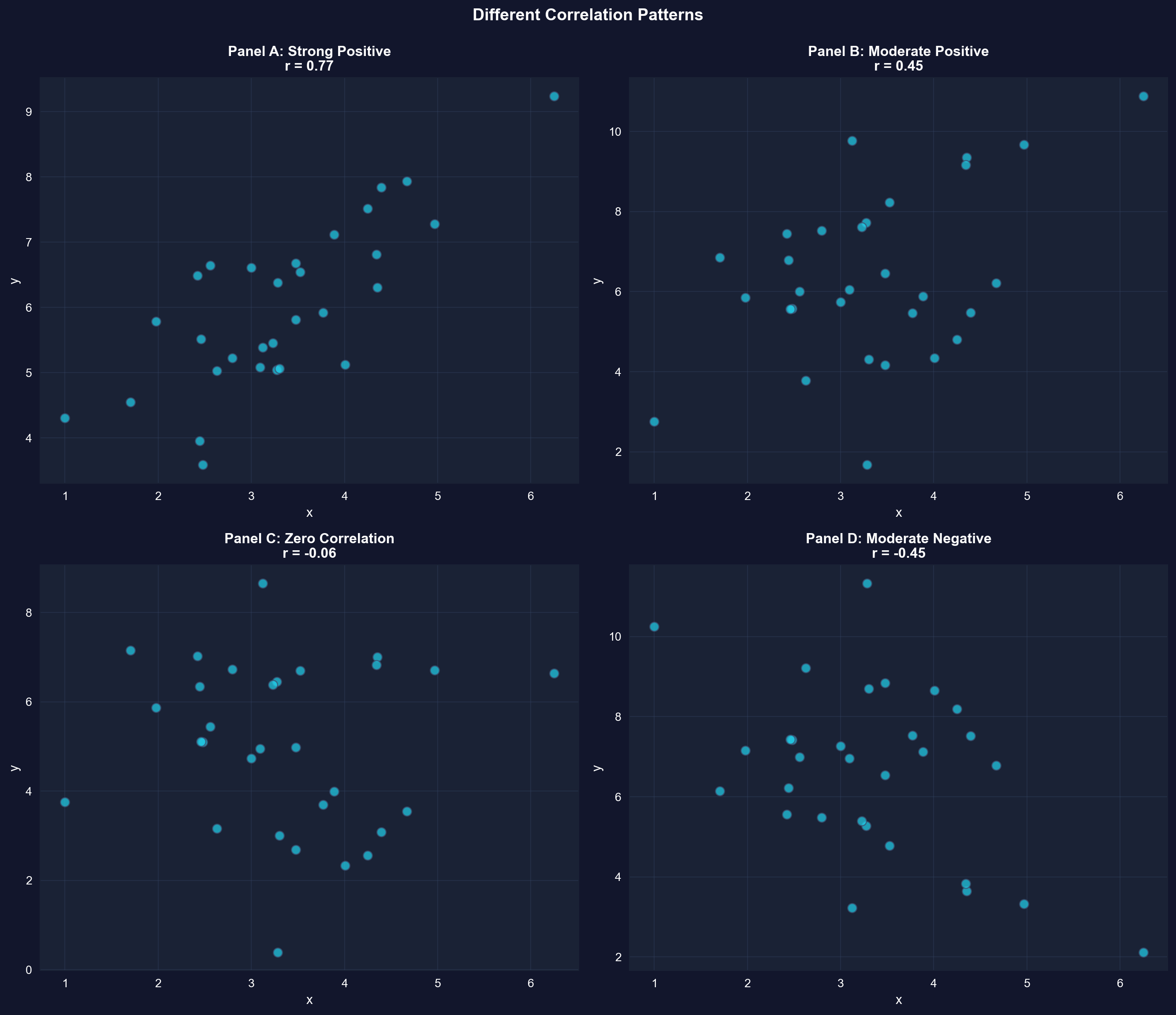
### Illustration: Different Correlation Patterns
To build intuition, let's visualize simulated data with different correlation coefficients.
```{python}
# Different correlation patterns
np.random.seed(12345)
n = 30
x = np.random.normal(3, 1, n)
u1 = np.random.normal(0, 0.8, n)
y1 = 3 + x + u1  # Strong positive correlation
u2 = np.random.normal(0, 2, n)
y2 = 3 + x + u2  # Moderate positive correlation
y3 = 5 + u2      # Zero correlation
y4 = 10 - x - u2 # Moderate negative correlation

correlations = [
    np.corrcoef(x, y1)[0, 1],
    np.corrcoef(x, y2)[0, 1],
    np.corrcoef(x, y3)[0, 1],
    np.corrcoef(x, y4)[0, 1]
]

fig, axes = plt.subplots(2, 2, figsize=(14, 12))
axes = axes.flatten()

datasets = [(x, y1, 'Panel A: Strong Positive'),
            (x, y2, 'Panel B: Moderate Positive'),
            (x, y3, 'Panel C: Zero Correlation'),
            (x, y4, 'Panel D: Moderate Negative')]

for idx, (ax, (x_data, y_data, title), corr) in enumerate(zip(axes, datasets, correlations)):
    ax.scatter(x_data, y_data, s=60, alpha=0.7, color='#22d3ee', edgecolor='#3a4a6b')
    ax.set_xlabel('x', fontsize=11)
    ax.set_ylabel('y', fontsize=11)
    ax.set_title(f'{title}\nr = {corr:.2f}', fontsize=12, fontweight='bold')
    ax.grid(True, alpha=0.3)

plt.suptitle('Different Correlation Patterns',
             fontsize=14, fontweight='bold', y=0.995)
plt.tight_layout()
plt.show()
```
**What to look for in each panel:**
- **Panel A** (r ~ 0.77): Points cluster tightly around an upward slope
- **Panel B** (r ~ 0.45): More scatter, but still positive relationship
- **Panel C** (r ~ -0.06): No systematic pattern
- **Panel D** (r ~ -0.45): Points follow a downward slope
## 5.5 Regression Line
The **regression line** provides the "best-fitting" linear summary of the relationship between y (dependent variable) and x (independent variable):
$$\hat{y} = b_1 + b_2 x$$
where:
- $\hat{y}$ = predicted (fitted) value of y
- $b_1$ = intercept (predicted y when x = 0)
- $b_2$ = slope (change in y for one-unit increase in x)
**Ordinary Least Squares (OLS)** chooses $b_1$ and $b_2$ to minimize the sum of squared residuals:
$$\min_{b_1, b_2} \sum_{i=1}^n (y_i - b_1 - b_2 x_i)^2$$
**Formulas:**
$$b_2 = \frac{\sum_{i=1}^n (x_i - \bar{x})(y_i - \bar{y})}{\sum_{i=1}^n (x_i - \bar{x})^2} = \frac{s_{xy}}{s_x^2}$$
$$b_1 = \bar{y} - b_2 \bar{x}$$
Correlation measures the strength of association, but doesn't provide a prediction equation. Now we turn to regression analysis, which fits a line to predict y from x and quantifies how much y changes per unit change in x.
```{python}
# Fit OLS regression
fit = pf.feols('price ~ size', data=data_house)

# Key results
intercept = fit.coef()['Intercept']
slope = fit.coef()['size']
r_squared = fit._r2
print(f"Estimated equation: price = {intercept:,.2f} + {slope:.4f} x size")
print(f"R-squared: {r_squared:.4f} ({r_squared*100:.1f}% of variation explained)")

# Full regression output
fit.summary()
```
> **Key Concept 5.5: Ordinary Least Squares**
>
> The method of ordinary least squares (OLS) chooses the regression line to minimize the sum of squared residuals. This yields formulas for the slope (b₂ = Σ(xᵢ - x̄)(yᵢ - ȳ) / Σ(xᵢ - x̄)²) and intercept (b₁ = ȳ - b₂x̄) that can be computed from the data. The slope equals the covariance divided by the variance of x.
The next cell pulls the intercept and slope out of the fitted model and translates each into plain English, with worked examples for houses 100 and 500 square feet larger.
```{python}
# Extract and interpret coefficients
intercept = fit.coef()['Intercept']
slope = fit.coef()['size']
r_squared = fit._r2

# Key regression coefficients
print(f"Fitted regression line:")
print(f"  ŷ = {intercept:,.2f} + {slope:.2f} × size")
print(f"\nIntercept (b₁): ${intercept:,.2f}")
print(f"  Interpretation: Predicted price when size = 0")
print(f"  (Not economically meaningful in this case)")

print(f"\nSlope (b₂): ${slope:.2f} per square foot")
print(f"  Interpretation: Each additional square foot is associated with")
print(f"  a ${slope:.2f} increase in house price, on average.")

print(f"\nExamples:")
print(f"  • 100 sq ft larger → ${slope * 100:,.2f} higher price")
print(f"  • 500 sq ft larger → ${slope * 500:,.2f} higher price")

print(f"\nR-squared: {r_squared:.4f} ({r_squared*100:.2f}%)")
print(f"  {r_squared*100:.2f}% of price variation is explained by size")
```
**Key findings from the house price regression:**
**The fitted equation:**
```
ŷ = 115,017 + 73.77 × size
```
**1. Slope coefficient: \$73.77 per square foot (p < 0.001)**
- **Interpretation**: Each additional square foot is associated with a \$73.77 increase in house price, on average
- **Statistical significance**: p-value ≈ 0 (highly significant)
- **Confidence interval**: [50.84, 96.70] — we're 95% confident the true slope is between \$51 and \$97 per sq ft
*Note: These standard errors, p-values, and confidence intervals use the classical (iid) formulas reported by default; formal statistical inference for regression — including robust standard errors — is covered in Chapter 7.*
**2. Practical examples:**
- 100 sq ft larger → \$73.77 × 100 = **\$7,377** higher price
- 500 sq ft larger → \$73.77 × 500 = **\$36,885** higher price
- 1,000 sq ft larger → \$73.77 × 1,000 = **\$73,770** higher price
**3. Intercept: \$115,017**
- **Mathematical interpretation**: Predicted price when size = 0
- **Reality check**: A house can't have zero square feet!
- **Better interpretation**: This is just where the regression line crosses the y-axis
- Don't take it literally — it's outside the data range (1,400-3,300 sq ft)
**4. R-squared: 0.617 (61.7%)**
- Size explains **62% of the variation** in house prices
- The remaining **38%** is due to other factors:
- Location (neighborhood quality, schools)
- Physical characteristics (bathrooms, garage, condition)
- Market conditions (time of sale)
- Unique features (view, lot size, upgrades)
**Comparison to correlation:**
- We computed r = 0.7858
- R² = (0.7858)² = 0.617 (they match!)
- For simple regression, R² always equals r²
**Economic interpretation:** The strong relationship (R² = 0.62) between size and price makes economic sense. Buyers pay a substantial premium for additional space. However, the imperfect fit reminds us that many factors beyond size affect house values.
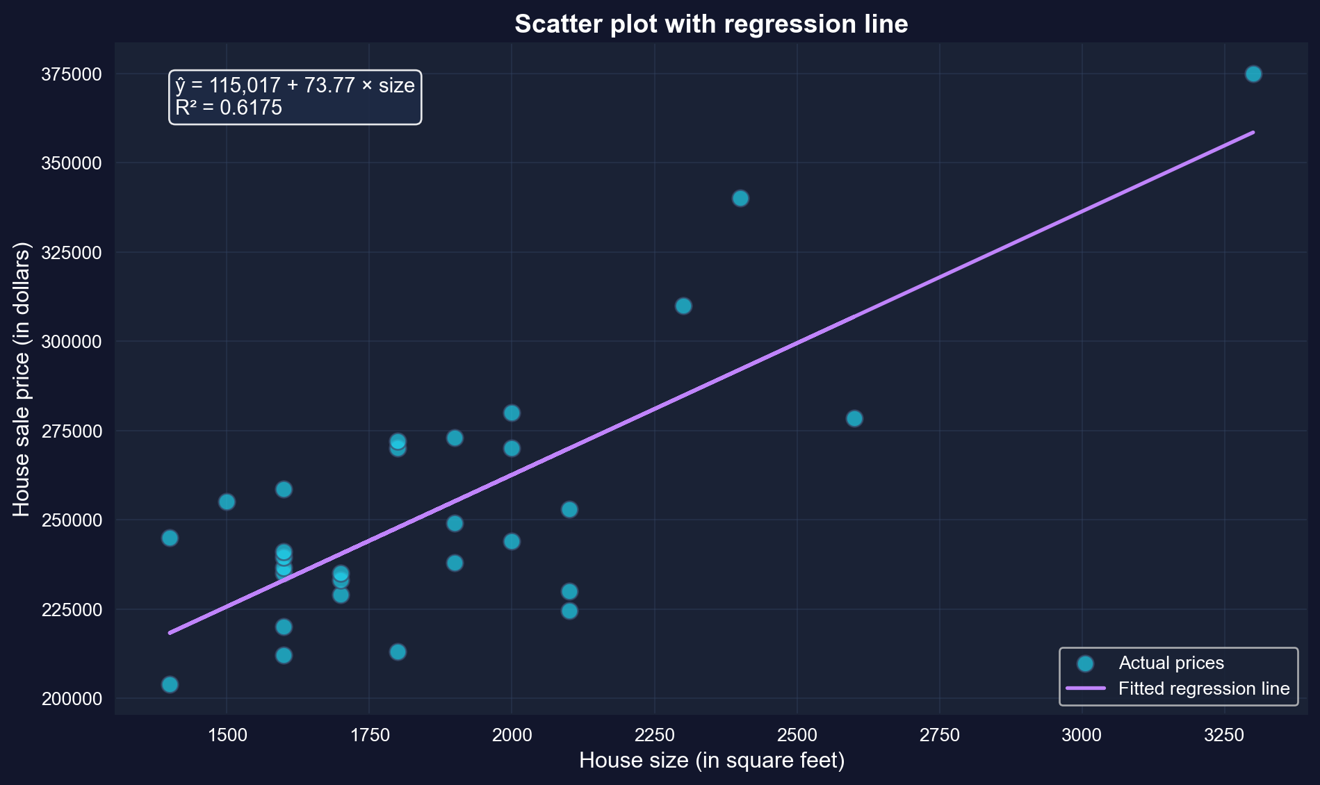
### Visualizing the Fitted Regression Line
Plotting the fitted line on top of the scatter makes the OLS idea concrete: the line passes through the middle of the point cloud, balancing points above and below. The annotation box reports the estimated equation and R².
```{python}
# Scatter plot with regression line
fig, ax = plt.subplots(figsize=(10, 6))
ax.scatter(size, price, s=80, alpha=0.7, color='#22d3ee',
           edgecolor='#3a4a6b', label='Actual prices')
ax.plot(size, fit.predict(), color='#c084fc', linewidth=2, label='Fitted regression line')

# Add equation to plot
equation_text = f'ŷ = {intercept:,.0f} + {slope:.2f} × size\nR² = {r_squared:.4f}'
ax.text(0.05, 0.95, equation_text,
        transform=ax.transAxes, fontsize=11,
        verticalalignment='top',
        bbox=dict(boxstyle='round', facecolor='#1e2a45', alpha=0.9))

ax.set_xlabel('House size (in square feet)', fontsize=12)
ax.set_ylabel('House sale price (in dollars)', fontsize=12)
ax.set_title('Scatter plot with regression line',
             fontsize=14, fontweight='bold')
ax.legend(loc='lower right')
ax.grid(True, alpha=0.3)
plt.tight_layout()
plt.show()
```
The purple line is the "line of best fit." It minimizes the sum of squared vertical distances from each point to the line.
### Special Case: Intercept-Only Regression
When we regress y on only an intercept (no x variable), the OLS estimate equals the sample mean of y. This shows that regression is a natural extension of univariate statistics.
```{python}
# Intercept-only regression
fit_intercept = pf.feols('price ~ 1', data=data_house)

# Intercept-only regression
print(f"Intercept from regression: ${fit_intercept.coef()['Intercept']:,.2f}")
print(f"Sample mean of price:      ${price.mean():,.2f}")
# These are equal, confirming that OLS generalizes the sample mean.
```
Both numbers are \$253,910.34: with no explanatory variable, the best least-squares prediction of price is simply its sample mean. Regression therefore generalizes the univariate summaries of Chapter 2 rather than replacing them.
## 5.6 Measures of Model Fit
Two key measures assess how well the regression line fits the data:
### R-squared (R²)
Proportion of variation in y explained by x (ranges from 0 to 1):
$$R^2 = \frac{\text{Explained SS}}{\text{Total SS}} = \frac{\sum (\hat{y}_i - \bar{y})^2}{\sum (y_i - \bar{y})^2} = 1 - \frac{\sum (y_i - \hat{y}_i)^2}{\sum (y_i - \bar{y})^2}$$
**Interpretation:**
- $R^2 = 0$: x explains none of the variation in y
- $R^2 = 1$: x explains all of the variation in y
- $R^2 = r^2$ (for simple regression, R² equals the squared correlation)
### Standard Error of the Regression (s_e)
Standard deviation of the residuals (typical size of prediction errors):
$$s_e = \sqrt{\frac{1}{n-2} \sum_{i=1}^n (y_i - \hat{y}_i)^2}$$
**Interpretation:**
- Lower $s_e$ means fitted values are closer to actual values
- Units: same as y (dollars in our example)
- Dividing by (n-2) accounts for estimation of two parameters
We've estimated the regression line. Now we assess how well this line fits the data using R-squared (proportion of variation explained) and the standard error of regression (typical prediction error).
```{python}
# Measures of model fit
r_squared = fit._r2
adj_r_squared = fit._adj_r2
se = np.sqrt(np.mean(fit._u_hat**2) * len(data_house) / (len(data_house) - 2))
n = len(data_house)

print(f"\nR-squared:               {r_squared:.4f}")
print(f"  {r_squared*100:.2f}% of price variation explained by size")

print(f"\nAdjusted R-squared:      {adj_r_squared:.4f}")
print(f"  Penalizes for number of regressors")

print(f"\nStandard error (s_e):    ${se:,.2f}")
print(f"  Typical prediction error is about ${se:,.0f}")

# Verify R² = r²
r = corr_matrix.loc['price', 'size']
print(f"\nVerification: R² = r²")
print(f"  R² = {r_squared:.4f}")
print(f"  r² = {r**2:.4f}")
print(f"  Match: {np.isclose(r_squared, r**2)}")
```
> **Key Concept 5.6: R-Squared Goodness of Fit**
>
> R-squared measures the fraction of variation in y explained by the regression on x. It ranges from 0 (no explanatory power) to 1 (perfect fit). For bivariate regression, R² equals the squared correlation coefficient (R² = r²ₓᵧ). R² = 0.62 means 62% of house price variation is explained by size variation, while 38% is due to other factors.
**Understanding R² = 0.617 and Standard Error = \$23,551**
**1. R-squared (coefficient of determination):**
- **Value**: 0.617 or 61.7%
- **Meaning**: Size explains 61.7% of the variation in house prices
- **The other 38.3%**: Due to factors not in our model (location, quality, age, etc.)
**How to think about R²:**
- **R² = 0**: x has no predictive power (horizontal line)
- **R² = 0.617**: x has substantial predictive power (our case)
- **R² = 1**: x predicts y perfectly (all points on the line)
**Is R² = 0.617 "good"?**
- **For cross-sectional data**: Yes, this is quite good!
- **Context matters**:
- Lab experiments: Often R² > 0.9
- Cross-sectional economics: R² = 0.2-0.6 is typical
- Time series: R² = 0.7-0.95 is common
- **Single predictor**: Size alone explains most variation — impressive!
**2. Standard error: \$23,551**
- **Meaning**: Typical prediction error (residual size)
- **Context**:
- Average house price: \$253,910
- Typical error: \$23,551 (about 9% of average)
- This is reasonably accurate for house price prediction
**3. Verification: R² = r²**
- Correlation: r = 0.7858
- R-squared: R² = 0.617
- Check: (0.7858)² = 0.617
- For simple regression, these are always equal
**4. Sum of Squares decomposition:**
```
Total SS = Explained SS + Residual SS
100% = 61.7% + 38.3%
```
**Practical implications:**
- **For predictions**: Expect errors around ±\$23,000
- **For policy**: Size is important, but other factors matter too
- **For research**: May want to add more variables (multiple regression, Chapters 10-12)
### Illustration: Total SS, Explained SS, and Residual SS
Let's create a simple example to visualize how R² is computed.
```{python}
# Simulated data for demonstration
np.random.seed(123456)
x_sim = np.arange(1, 6)
epsilon = np.random.normal(0, 2, 5)
y_sim = 1 + 2*x_sim + epsilon

df_sim = pd.DataFrame({'x': x_sim, 'y': y_sim})
fit_sim = pf.feols('y ~ x', data=df_sim)

# Simulated data for model fit illustration
fitted_sim = fit_sim.predict()
resid_sim = fit_sim._u_hat
print(f"{'x':<5} {'y':<10} {'y-hat':<10} {'Residual (e)':<15} {'(y - y-bar)':<10} {'(y-hat - y-bar)':<10}")
for i in range(len(x_sim)):
    print(f"{x_sim[i]:<5} {y_sim[i]:<10.4f} {fitted_sim[i]:<10.4f} "
          f"{resid_sim[i]:<15.4f} {y_sim[i] - y_sim.mean():<10.4f} "
          f"{fitted_sim[i] - y_sim.mean():<10.4f}")

print(f"\nSums of Squares:")
total_ss = np.sum((y_sim - y_sim.mean())**2)
explained_ss = np.sum((fitted_sim - y_sim.mean())**2)
residual_ss = np.sum(resid_sim**2)

print(f"  Total SS     = {total_ss:.4f}")
print(f"  Explained SS = {explained_ss:.4f}")
print(f"  Residual SS  = {residual_ss:.4f}")
print(f"\nCheck: Explained SS + Residual SS = {explained_ss + residual_ss:.4f}")
print(f"       Total SS                     = {total_ss:.4f}")

print(f"\nR² = Explained SS / Total SS = {explained_ss / total_ss:.4f}")
print(f"R² from model = {fit_sim._r2:.4f}")
```
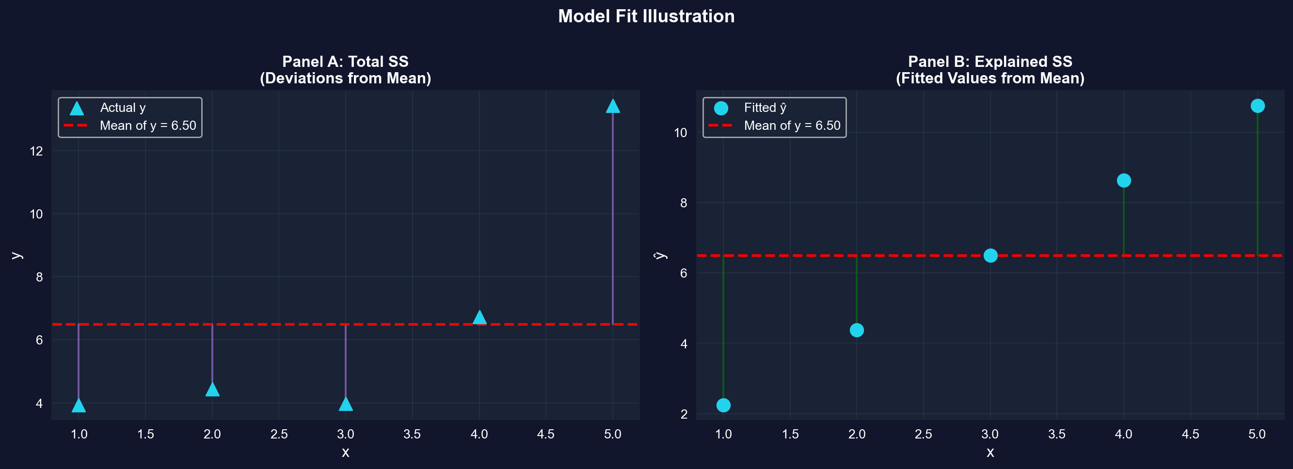
The same decomposition can be shown graphically. The next figure draws the deviations behind Total SS (actual points to the mean, Panel A) and Explained SS (fitted values to the mean, Panel B) as vertical lines.
```{python}
# Visualization of model fit
fig, axes = plt.subplots(1, 2, figsize=(14, 5))

# Panel A: Total SS (deviations from mean)
axes[0].scatter(x_sim, y_sim, s=100, color='#22d3ee', marker='^', label='Actual y', zorder=3)
axes[0].axhline(y=y_sim.mean(), color='red', linewidth=2, linestyle='--',
                label=f'Mean of y = {y_sim.mean():.2f}', zorder=2)
# Draw vertical lines from points to mean
for i in range(len(x_sim)):
    axes[0].plot([x_sim[i], x_sim[i]], [y_sim[i], y_sim.mean()],
                 '-', color='#c084fc', linewidth=1.5, alpha=0.5, zorder=1)
axes[0].set_xlabel('x', fontsize=12)
axes[0].set_ylabel('y', fontsize=12)
axes[0].set_title('Panel A: Total SS\n(Deviations from Mean)', fontsize=12, fontweight='bold')
axes[0].legend()
axes[0].grid(True, alpha=0.3)

# Panel B: Explained SS (deviations of fitted values from mean)
axes[1].scatter(x_sim, fitted_sim, s=100, color='#22d3ee',
                marker='o', label='Fitted ŷ', zorder=3)
axes[1].axhline(y=y_sim.mean(), color='red', linewidth=2, linestyle='--',
                label=f'Mean of y = {y_sim.mean():.2f}', zorder=2)
# Draw vertical lines from fitted values to mean
for i in range(len(x_sim)):
    axes[1].plot([x_sim[i], x_sim[i]], [fitted_sim[i], y_sim.mean()],
                 'g-', linewidth=1.5, alpha=0.5, zorder=1)
axes[1].set_xlabel('x', fontsize=12)
axes[1].set_ylabel('ŷ', fontsize=12)
axes[1].set_title('Panel B: Explained SS\n(Fitted Values from Mean)', fontsize=12, fontweight='bold')
axes[1].legend()
axes[1].grid(True, alpha=0.3)

plt.suptitle('Model Fit Illustration',
             fontsize=14, fontweight='bold', y=1.00)
plt.tight_layout()
plt.show()
```
**What to look for:** Panel A shows Total SS (how far actual y values are from their mean). Panel B shows Explained SS (how far fitted values are from the mean). R-squared = (Explained SS) / (Total SS) measures the proportion explained.
**Practical Implications of R² in Economics:**
In applied econometrics, R² values around 0.60 are considered quite strong for cross-sectional data. Our R² = 0.617 tells us:
- **Size is a strong predictor**: House size explains most of the price variation
- **Other factors matter**: The remaining 38% is due to location, quality, age, amenities, etc.
- **Single-variable limits**: One predictor can only explain so much in complex real-world data
**Why R² varies by context:**
- **Lab experiments**: Often R² > 0.90 (controlled conditions, few confounding factors)
- **Cross-sectional economics**: Typically R² = 0.20-0.60 (many unobserved heterogeneities)
- **Time series data**: Often R² = 0.70-0.95 (trends and persistence dominate)
**Next step:** This motivates **multiple regression** (Chapters 10-12), where we include many explanatory variables simultaneously to capture more of the variation in y.
## 5.7 Computer Output Following Regression
Modern statistical software provides comprehensive regression output. Let's examine each component of the output for our house price regression.
```{python}
# Complete regression output
fit.summary()
```
**Guide to reading regression output:**
- **Top section** -- Model Summary: estimation method (OLS), dependent variable, inference type (iid = classical standard errors), number of observations
- **Middle section** -- Coefficients Table: Estimate, Std. Error, t value, Pr(>|t|), and the 2.5% / 97.5% confidence-interval bounds
- **Bottom section** -- Fit statistics: RMSE (the typical size of prediction errors) and R2
## 5.8 Prediction and Outliers
Once we have a fitted regression line, we can use it to predict y for any given value of x:
$$\hat{y} = b_1 + b_2 x^*$$
**Two types of predictions:**
1. **In-sample:** x is within the range of observed data (reliable)
2. **Out-of-sample:** x is outside the observed range (extrapolation - use with caution)
**Outliers** are observations that are unusually far from the regression line. They may indicate:
- Data entry errors
- Unusual circumstances
- Model misspecification
- Natural variation
```{python}
# Prediction examples

# Predict for a 2000 sq ft house
new_size = pd.DataFrame({'size': [2000]})
predicted_price = fit.predict(newdata=new_size)

print(f"\nExample 1: Predict price for a 2,000 sq ft house")
print(f"  Using the model: ŷ = {intercept:.2f} + {slope:.2f} × 2000")
print(f"  Predicted price: ${predicted_price[0]:,.2f}")

# Manual calculation
manual_prediction = intercept + slope * 2000
print(f"  Manual check: ${manual_prediction:,.2f}")

# Multiple predictions
print(f"\nExample 2: Predictions for various house sizes")
sizes_to_predict = [1500, 1800, 2000, 2500, 3000]
predictions = pd.DataFrame({'size': sizes_to_predict})
predictions['predicted_price'] = fit.predict(newdata=predictions)

display(predictions)

print(f"\nObserved size range: {size.min():.0f} to {size.max():.0f} sq ft")
print(f"  1500, 1800, 2000 are in-sample (reliable)")
print(f"  3000 is at the edge; 3500+ would be extrapolation (less reliable)")
```
**Example prediction: 2,000 sq ft house**
**Predicted price: \$262,559**
Using our regression equation:
```
ŷ = \$115,017 + \$73.77 × 2,000 = \$262,559
```
**How reliable is this prediction?**
**1. In-sample vs. out-of-sample:**
- Our data range: 1,400 to 3,300 sq ft
- Prediction at 2,000 sq ft: **in-sample** (safe)
- Prediction at 5,000 sq ft: **out-of-sample** (risky extrapolation)
**2. Prediction accuracy:**
- Standard error: \$23,551
- Typical error: about ±\$23,000 around the prediction
- **Informal prediction interval**: roughly \$239,000 to \$286,000
- (Chapter 7 will cover formal prediction intervals)
**Understanding Prediction Uncertainty:**
Our prediction ŷ = $262,559 for a 2,000 sq ft house is a **point estimate** — our best single guess. But predictions have uncertainty:
**Sources of uncertainty:**
- **Estimation error**: We don't know the true β₁ and β₂, only estimates b₁ and b₂
- **Fundamental randomness**: Even houses of identical size sell for different prices
- **Model limitations**: Our simple model omits many price determinants
**Preview of Chapter 7**: We'll learn to construct **prediction intervals** like:
- "We're 95% confident the price will be between $213,000 and $312,000"
- This acknowledges uncertainty while still providing useful guidance
For now, remember: the standard error ($23,551) gives a rough sense of typical prediction errors.
**3. Why predictions aren't perfect:**
- Our model only includes size
- Missing factors affect individual houses:
- Neighborhood quality
- Number of bathrooms
- Lot size
- Age and condition
- Unique features
**Understanding residuals:**
A **residual** is the prediction error for one observation:
```
residual = actual price - predicted price
         = y - ŷ
```
**Positive residual**: House sold for MORE than predicted (underestimate)
**Negative residual**: House sold for LESS than predicted (overestimate)
**Why do some houses have large residuals?**
- Particularly desirable/undesirable location
- Exceptional quality or poor condition
- Unique features not captured by size alone
- May indicate measurement error or unusual circumstances
**Key insight:** The regression line gives the **average** relationship. Individual houses deviate from this average based on their unique characteristics.
```{python}
# Outlier detection

# Add residuals and standardized residuals to dataset
data_house['fitted'] = fit.predict()
data_house['residual'] = fit._u_hat
data_house['std_resid'] = fit._u_hat / se  # standardize by s_e = sqrt(RSS/(n-2)) from Section 5.6

# Observations with large residuals (>2 std deviations)
outliers = data_house[np.abs(data_house['std_resid']) > 2]

print(f"\nObservations with large residuals (|standardized residual| > 2):")
if len(outliers) > 0:
    print(outliers[['price', 'size', 'fitted', 'residual', 'std_resid']])
else:
    print("  None found (all residuals within 2 standard deviations)")

# Top 5 largest positive residuals
data_house.nlargest(5, 'residual', keep='all')[['price', 'size', 'fitted', 'residual']]
```
**What the output shows:** Exactly one house crosses the |standardized residual| > 2 threshold: a 2,400 sq ft house that sold for \$340,000 — about \$47,900 more than the fitted line predicts (standardized residual ≈ 2.04). With 29 observations, one residual beyond two standard deviations is roughly what chance alone would produce, so this is a mild outlier worth a second look (perhaps a premium location or condition), not a data error that demands removal.
## 5.9 Regression and Correlation
There's a close relationship between the regression slope and the correlation coefficient:
$$b_2 = r_{xy} \times \frac{s_y}{s_x}$$
**Key insights:**
- $r_{xy} > 0 \Rightarrow b_2 > 0$ (positive correlation means positive slope)
- $r_{xy} < 0 \Rightarrow b_2 < 0$ (negative correlation means negative slope)
- $r_{xy} = 0 \Rightarrow b_2 = 0$ (zero correlation means zero slope)
**But regression and correlation differ:**
- Correlation treats x and y symmetrically: $r_{xy} = r_{yx}$
- Regression does not: slope from regressing y on x $\neq$ inverse of slope from regressing x on y
**Why This Relationship Matters:**
The formula **b₂ = r × (sᵧ/sₓ)** reveals an important insight about the connection between correlation and regression:
**Correlation (r):**
- Scale-free measure (unitless)
- Same value regardless of measurement units
- Symmetric: r(price, size) = r(size, price)
**Regression slope (b₂):**
- Scale-dependent (has units: $/sq ft in our example)
- Changes when we rescale variables
- Asymmetric: slope from price~size ≠ inverse of slope from size~price
**The ratio (sᵧ/sₓ):**
- Converts between correlation and slope
- Accounts for the relative variability of y and x
- Explains why slopes have interpretable units while r does not
**Practical implication:** This is why we use **regression** (not just correlation) in economics—we need interpretable coefficients with units ($/sq ft, % change, etc.) to make policy recommendations and predictions.
```{python}
# Relationship: slope = correlation x (SD_Y / SD_X)
r = corr_matrix.loc['price', 'size']
s_y = price.std()
s_x = size.std()
b2_from_r = r * (s_y / s_x)

print(f"\nFrom regression:")
print(f"  Slope (b₂) = {slope:.4f}")

print(f"\nFrom correlation:")
print(f"  r = {r:.4f}")
print(f"  s_y = {s_y:.4f}")
print(f"  s_x = {s_x:.4f}")
print(f"  b₂ = r × (s_y / s_x) = {r:.4f} × ({s_y:.4f} / {s_x:.4f}) = {b2_from_r:.4f}")

print(f"\nMatch: {np.isclose(slope, b2_from_r)}")
```
The two routes agree exactly: multiplying r = 0.7858 by the ratio of standard deviations (s_y/s_x ≈ 37,391/398) reproduces the OLS slope b₂ = 73.77. The regression slope is just the correlation rescaled into units of y per unit of x — which is why the slope, unlike r, changes when we change measurement units.
## 5.10 Causation
**Critical distinction:** Regression measures **association**, not **causation**.
Our regression shows that larger houses are associated with higher prices. But we cannot conclude that:
- Adding square footage to a house will increase its price by \$73.77 per sq ft
**Why not?**
- **Omitted variables:** Many factors affect price (location, quality, age, condition)
- **Reverse causality:** Could price influence size? (e.g., builders construct larger houses in expensive areas)
- **Confounding:** A third variable (e.g., neighborhood quality) may influence both size and price
**Demonstrating non-symmetry: Reverse regression**
If we regress x on y (instead of y on x), we get a different slope:
- Original: $\hat{y} = b_1 + b_2 x$
- Reverse: $\hat{x} = c_1 + c_2 y$
These two regressions answer different questions and have different slopes!
> **Key Concept 5.7: Association vs. Causation**
>
> Regression measures association, not causation. A regression coefficient shows how much y changes when x changes, but does not prove that x causes y. Causation requires additional assumptions, experimental design, or advanced econometric techniques (Chapter 17). Regression is directional and asymmetric: regressing y on x gives a different slope than regressing x on y.
We've learned how to measure and quantify relationships. Now we address a critical question: does association imply causation? This distinction is fundamental to interpreting regression results correctly.
```{python}
# Reverse regression: demonstrating non-symmetry
fit_reverse = pf.feols('size ~ price', data=data_house)

print("\nOriginal Regression (price ~ size):")
print(f"  ŷ = {fit.coef()['Intercept']:,.2f} + {fit.coef()['size']:.4f} × size")
print(f"  Slope: {fit.coef()['size']:.4f}")
print(f"  R-squared: {fit._r2:.4f}")

print("\nReverse Regression (size ~ price):")
print(f"  x̂ = {fit_reverse.coef()['Intercept']:.2f} + {fit_reverse.coef()['price']:.6f} × price")
print(f"  Slope: {fit_reverse.coef()['price']:.6f}")
print(f"  R-squared: {fit_reverse._r2:.4f}")

print("\nComparison:")
print(f"  1 / b₂ = 1 / {fit.coef()['size']:.4f} = {1/fit.coef()['size']:.6f}")
print(f"  c₂ = {fit_reverse.coef()['price']:.6f}")
print(f"  Are they equal? {np.isclose(1/fit.coef()['size'], fit_reverse.coef()['price'])}")

print("\nKey insight:")
print("  • Original slope: 1 sq ft increase in size → ${:.2f} increase in price".format(fit.coef()['size']))
print("  • Reverse slope: $1 increase in price → {:.6f} sq ft increase in size".format(fit_reverse.coef()['price']))
print("  • These answer different questions!")

print("\nNote: Both regressions have the same R² because in simple regression,")
print("      R² = r² regardless of which variable is on the left-hand side.")
```
**CRITICAL DISTINCTION: Association ≠ Causation**
**What our regression shows:**
```
price = 115,017 + 73.77 × size
```
**What we CAN say:**
- Larger houses are **associated with** higher prices
- Size and price move together in a predictable way
- We can **predict** price from size with reasonable accuracy
**What we CANNOT say:**
- Adding square footage to your house will increase its value by exactly \$73.77 per sq ft
- Size **causes** the price to be higher
- Buying a bigger house will make it worth more
**Why not? Three reasons:**
**1. Omitted variables (confounding)**
- Many factors affect BOTH size and price:
- **Neighborhood quality**: Rich neighborhoods have larger, more expensive houses
- **Lot size**: Bigger lots allow bigger houses AND command higher prices
- **Build quality**: High-quality construction → larger AND more expensive
- The \$73.77 coefficient captures both direct effects of size AND correlated factors
**2. Reverse causality**
- Our model: size → price
- Alternative: price → size?
- In expensive areas, builders construct larger houses because buyers can afford them
- The causal arrow may run both ways
**3. Measurement of different concepts**
- **Cross-sectional comparison**: 2,000 sq ft house vs. 1,500 sq ft house (different houses)
- **Causal question**: What happens if we ADD 500 sq ft to ONE house?
- These are different questions with potentially different answers!
**The reverse regression demonstration:**
**Original**: price ~ size
- Slope: \$73.77 per sq ft
**Reverse**: size ~ price
- Slope: 0.00837 sq ft per dollar
**Key observation:**
- If regression = causation, these should be reciprocals
- 1 / 73.77 = 0.01356 ≠ 0.00837
- They're NOT reciprocals! This reveals regression measures association, not causation
**When can we claim causation?**
- **Randomized experiments**: Randomly assign house sizes
- **Natural experiments**: Find exogenous variation in size
- **Careful econometric methods**: Instrumental variables, difference-in-differences, etc. (advanced topics)
**Economic intuition:** In reality, building an addition probably DOES increase house value, but perhaps not by exactly \$73.77/sq ft. The true causal effect depends on quality, location, and market conditions — factors our simple regression doesn't isolate.
## 5.11 Nonparametric Regression
**Parametric regression** (like OLS) assumes a specific functional form (e.g., linear).
**Nonparametric regression** allows the relationship to be more flexible, letting the data determine the shape without imposing a specific functional form.
**Common methods:**
1. **LOWESS** (Locally Weighted Scatterplot Smoothing): Fits weighted regressions in local neighborhoods
2. **Kernel smoothing:** Weighted averages using kernel functions
3. **Splines:** Piecewise polynomials
**Uses:**
- Exploratory data analysis
- Checking linearity assumption
- Flexible modeling when functional form is unknown
**When to Use Nonparametric vs. Parametric Regression:**
**Use parametric (OLS linear regression) when:**
- Theory suggests a linear relationship
- You need interpretable coefficients ($73.77 per sq ft)
- Sample size is small to moderate (n < 100)
- You want statistical inference (t-tests, confidence intervals)
**Use nonparametric (LOWESS, kernel) when:**
- Exploring data without strong prior assumptions
- Checking whether linear model is appropriate (diagnostic)
- Relationship appears curved or complex
- Large sample size (n > 100) provides enough data for flexible fitting
**Best practice**: Start with scatter plot + nonparametric curve to check for nonlinearity, then use parametric model if linear assumption is reasonable.
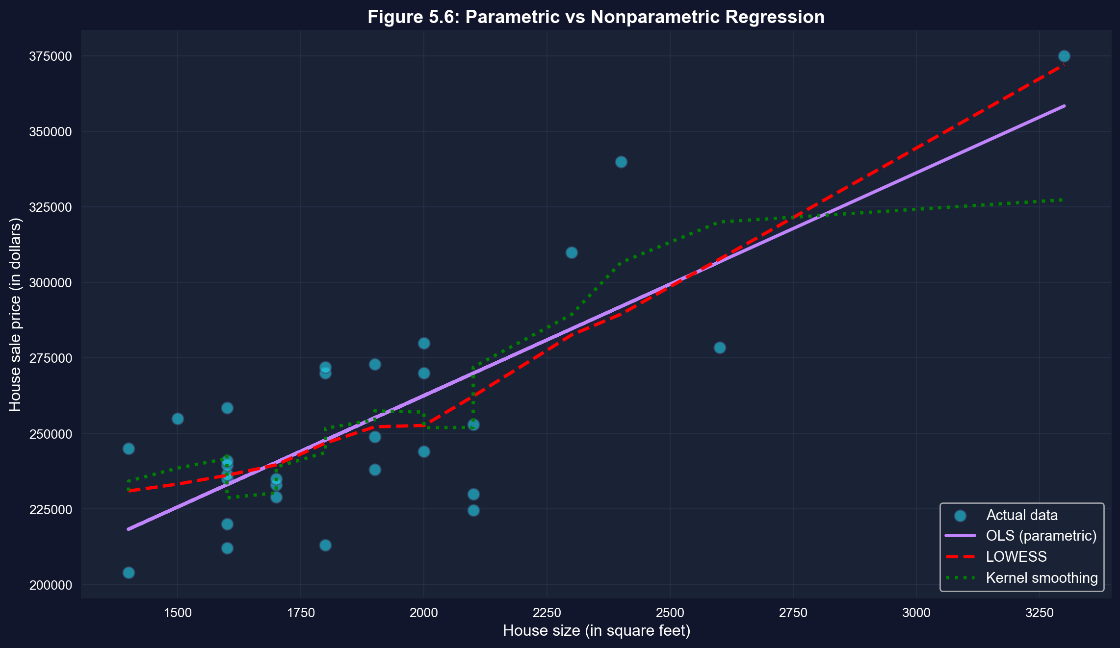
```{python}
# Nonparametric regression

# LOWESS smoothing
lowess_result = lowess(price, size, frac=0.6)

# Kernel smoothing (Gaussian filter approximation)
sort_idx = np.argsort(size)
size_sorted = size.iloc[sort_idx]
price_sorted = price.iloc[sort_idx]
sigma = 2  # bandwidth parameter
price_smooth = gaussian_filter1d(price_sorted, sigma)

# Plot comparison
fig, ax = plt.subplots(figsize=(12, 7))

# Scatter plot
ax.scatter(size, price, s=80, alpha=0.6, color='#22d3ee',
           edgecolor='#3a4a6b', label='Actual data', zorder=1)

# OLS line
ax.plot(size, fit.predict(), color='#c084fc', linewidth=2.5,
        label='OLS (parametric)', zorder=2)

# LOWESS
ax.plot(lowess_result[:, 0], lowess_result[:, 1], color='red',
        linewidth=2.5, linestyle='--', label='LOWESS', zorder=3)

# Kernel smoothing
ax.plot(size_sorted, price_smooth, color='green', linewidth=2.5,
        linestyle=':', label='Kernel smoothing', zorder=4)

ax.set_xlabel('House size (in square feet)', fontsize=12)
ax.set_ylabel('House sale price (in dollars)', fontsize=12)
ax.set_title('Figure 5.6: Parametric vs Nonparametric Regression',
             fontsize=14, fontweight='bold')
ax.legend(fontsize=11, loc='lower right')
ax.grid(True, alpha=0.3)
plt.tight_layout()
plt.show()
```
**What to look for in this comparison:**
- **OLS** (purple solid): Assumes a linear relationship
- **LOWESS** (red dashed): Flexible, data-driven curve
- **Kernel smoothing** (green dotted): Another flexible method
- For this data, all three methods are similar, suggesting that the linear model is a reasonable approximation.
**Comparing three approaches to fitting the data:**
**1. OLS (Ordinary Least Squares) — PURPLE SOLID LINE**
- **Parametric**: Assumes linear relationship
- **Equation**: ŷ = \$115,017 + \$73.77 × size
- **Advantage**: Simple, interpretable, efficient
- **Limitation**: Restricted to straight lines
**2. LOWESS (Locally Weighted Scatterplot Smoothing) — RED DASHED**
- **Nonparametric**: Lets data determine the shape
- **Method**: Fits weighted regressions in local neighborhoods
- **Advantage**: Flexible, can capture curves
- **Limitation**: Harder to interpret, more complex
**3. Kernel Smoothing — GREEN DOTTED**
- **Nonparametric**: Weighted moving averages
- **Method**: Uses Gaussian kernel to smooth nearby points
- **Advantage**: Very smooth curves
- **Limitation**: Choice of bandwidth affects results
**What does this comparison tell us?**
**Key observation: All three lines are very similar!**
- LOWESS and kernel smoothing follow OLS closely
- No obvious systematic curvature
- The relationship appears genuinely linear
**This validates our linear model:**
- If nonparametric methods showed strong curvature, we'd question the linear assumption
- Since they align with OLS, the linear model is appropriate
- We can confidently use the simpler parametric approach
**When would nonparametric methods differ?**
**Example scenarios:**
- **Diminishing returns**: Price increases with size, but at a decreasing rate
- **Threshold effects**: Small houses have steep price-size relationship, large houses flatten
- **Nonlinear relationships**: Exponential, logarithmic, or polynomial patterns
**For our housing data:**
- Linear model works well
- Adding complexity (nonparametric) doesn't improve fit much
- **Occam's Razor**: Choose the simpler model when performance is similar
**Practical use of nonparametric methods:**
- **Exploratory analysis**: Check for nonlinearity before modeling
- **Model diagnostics**: Verify linear assumption
- **Flexible prediction**: When functional form is unknown
- **Complex relationships**: When theory doesn't suggest specific form
**Bottom line:** Nonparametric methods confirm that our linear regression is appropriate for this dataset. The relationship between house price and size is genuinely linear, not curved.
## Key Takeaways
### Visualization and Correlation
- **Two-way tabulations**, scatterplots, and correlation are essential first steps in bivariate analysis
- **Scatterplots** provide visual evidence of relationships and help identify direction, strength, form, and outliers
- Two-way tabulations with **expected frequencies** enable chi-squared tests of independence for categorical data
- The **correlation coefficient (r)** is a scale-free measure of linear association ranging from -1 to +1
- **Covariance** measures the direction of association but depends on the units of measurement
- For house price and size, **r = 0.786** indicates strong positive linear association
- **Autocorrelation** extends correlation to time series, measuring how a variable relates to its own past values
### Regression Analysis and Interpretation
- The **regression line** ŷ = b₁ + b₂x is estimated by **ordinary least squares (OLS)**, which minimizes the sum of squared residuals
- The **slope b₂** measures the change in y for a one-unit change in x and is the most important interpretable quantity
- For house prices, **b₂ = $73.77** means each additional square foot is associated with a $73.77 price increase
- The **intercept b₁** represents the predicted y when x = 0 (often not meaningful if x = 0 is outside the data range)
- **Residuals** (e = y - ŷ) measure prediction errors; OLS makes the sum of squared residuals as small as possible
- Regression of y on only an intercept yields the **sample mean** as the fitted value, showing OLS generalizes univariate statistics
- The formulas **b₂ = Σ(xᵢ - x̄)(yᵢ - ȳ) / Σ(xᵢ - x̄)²** and **b₁ = ȳ - b₂x̄** enable manual computation
- The regression slope equals **b₂ = rₓᵧ × (sᵧ/sₓ)**, connecting regression and correlation
### Model Fit and Evaluation
- **R-squared** measures the fraction of variation in y explained by x, ranging from 0 (no fit) to 1 (perfect fit)
- **R² = (Explained SS) / (Total SS) = 1 - (Residual SS) / (Total SS)**
- For bivariate regression, **R² = r²ₓᵧ** (squared correlation coefficient)
- For house prices, **R² = 0.617** means 62% of price variation is explained by size variation
- **Standard error of regression (sₑ)** measures the typical size of residuals in the units of y
- **Low R² doesn't mean regression is uninformative**—the coefficient can still be statistically significant and economically important
- R² depends on data aggregation and choice of dependent variable; use it to compare models with the **same dependent variable**
- Computer regression output provides coefficients, standard errors, t-statistics, p-values, and confidence intervals, along with fit measures such as R² and RMSE
### Prediction, Causation, and Extensions
- **Predictions** use ŷ = b₁ + b₂x* to forecast y for a given x*
- **In-sample predictions** use observed x values (fitted values); **out-of-sample predictions** use new x values
- **Extrapolation** beyond the sample range of x can be unreliable
- **Outliers** can strongly influence regression estimates, especially if far from both x̄ and ȳ
- **Association does not imply causation**—regression measures correlation, not causal effects
- **Confounding variables**, reverse causality, or selection bias can create associations without causation
- Establishing **causation** requires experimental design, natural experiments, or advanced econometric techniques (Chapter 17)
- **Regression is directional and asymmetric**: regressing y on x gives a different slope than regressing x on y
- The two slopes are **NOT reciprocals**, reflecting that regression treats y and x differently
- **Nonparametric regression** (local linear, lowess) provides flexible alternatives without assuming linearity
- Nonparametric methods are useful for **exploratory analysis** and checking the appropriateness of linear models
### Connection to Economic Analysis
- The strong relationship (R² = 0.62) between size and price makes economic sense: buyers pay a premium for space
- The imperfect fit reminds us that **many factors beyond size affect house values** (location, quality, age, condition)
- Regression provides the **foundation for econometric analysis**, allowing us to quantify economic relationships
- This chapter's bivariate methods extend naturally to **multiple regression** (Chapters 10-12) with many explanatory variables
- Understanding association vs. causation is **critical for policy analysis** and program evaluation
**Congratulations!** You've mastered the basics of bivariate data analysis and simple linear regression. You now understand how to measure and visualize relationships between two variables, fit and interpret a regression line, assess model fit, and recognize the crucial distinction between association and causation. These tools form the foundation for all econometric analysis!
> **Common Mistakes to Avoid**
>
> - **Confusing covariance and correlation**: Covariance depends on units, correlation is standardized
> - **Assuming correlation implies a linear relationship**: Correlation only measures linear association
> - **Ignoring outliers in correlation**: A single extreme point can dramatically change the correlation coefficient
**Python Libraries and Code:**
This single code block reproduces the core workflow of Chapter 5. It is self-contained — copy it into an empty notebook and run it to review the complete pipeline from descriptive statistics and scatter plots to OLS regression, R-squared decomposition, and nonparametric regression.
```python
# =============================================================================
# CHAPTER 5 CHEAT SHEET: Bivariate Data Summary
# =============================================================================

# --- Libraries ---
import pandas as pd                                         # data loading and manipulation
import matplotlib.pyplot as plt                              # creating plots and visualizations
# !pip install pyfixest  # uncomment if running in Google Colab
import pyfixest as pf                                        # fast OLS regression
from statsmodels.nonparametric.smoothers_lowess import lowess  # LOWESS nonparametric smoothing

# =============================================================================
# STEP 1: Load data directly from a URL
# =============================================================================
# pd.read_stata() reads Stata .dta files — the dataset has 29 house sales
url = "https://raw.githubusercontent.com/quarcs-lab/data-open/master/AED/AED_HOUSE.DTA"
data_house = pd.read_stata(url)

print(f"Dataset: {data_house.shape[0]} observations, {data_house.shape[1]} variables")

# =============================================================================
# STEP 2: Descriptive statistics — summarize each variable before comparing
# =============================================================================
# .describe() gives mean, std, min, quartiles, max for both variables
print(data_house[['price', 'size']].describe().round(2))

# =============================================================================
# STEP 3: Scatter plot — visualize the relationship before quantifying it
# =============================================================================
fig, ax = plt.subplots(figsize=(10, 6))
ax.scatter(data_house['size'], data_house['price'], s=60, alpha=0.7)
ax.set_xlabel('House Size (square feet)')
ax.set_ylabel('House Sale Price (dollars)')
ax.set_title('House Price vs Size')
ax.grid(True, alpha=0.3)
plt.tight_layout()
plt.show()

# =============================================================================
# STEP 4: Correlation coefficient — one number for direction and strength
# =============================================================================
# .corr() computes the Pearson correlation matrix; r is unit-free and symmetric
corr_matrix = data_house[['price', 'size']].corr()
r = corr_matrix.loc['price', 'size']

print(f"Correlation coefficient: r = {r:.4f}")
print(f"Strength: {'Strong' if abs(r) > 0.7 else 'Moderate' if abs(r) > 0.3 else 'Weak'}")
print(f"r² = {r**2:.4f} ({r**2*100:.1f}% of variation shared)")

# =============================================================================
# STEP 5: OLS regression — fit the best-fitting line
# =============================================================================
# Formula syntax: 'y ~ x' regresses y on x (intercept included automatically)
fit = pf.feols('price ~ size', data=data_house)

slope     = fit.coef()['size']        # marginal effect: $/sq ft
intercept = fit.coef()['Intercept']   # predicted price when size = 0
r_squared = fit._r2                   # proportion of variation explained

print(f"Estimated equation: price = {intercept:,.0f} + {slope:.2f} × size")
print(f"Interpretation: each additional sq ft is associated with ${slope:,.2f} higher price")
print(f"R-squared: {r_squared:.4f} ({r_squared*100:.1f}% of variation explained)")

# Full regression table (coefficients, std errors, t-stats, p-values, R²)
fit.summary()

# =============================================================================
# STEP 6: Scatter plot with fitted line and R² — visualize model fit
# =============================================================================
# fit.predict() contains the predicted y-values from the estimated equation
fig, ax = plt.subplots(figsize=(10, 6))
ax.scatter(data_house['size'], data_house['price'], s=60, alpha=0.7, label='Actual prices')
ax.plot(data_house['size'], fit.predict(), color='red', linewidth=2, label='Fitted line')
ax.set_xlabel('House Size (square feet)')
ax.set_ylabel('House Sale Price (dollars)')
ax.set_title(f'OLS: price = {intercept:,.0f} + {slope:.2f} × size  (R² = {r_squared:.2%})')
ax.legend()
ax.grid(True, alpha=0.3)
plt.tight_layout()
plt.show()

# =============================================================================
# STEP 7: Reverse regression — association is NOT causation
# =============================================================================
# If regression = causation, the reverse slope would be 1/slope. It is not.
fit_reverse = pf.feols('size ~ price', data=data_house)

print(f"price ~ size  slope: {slope:.4f}")
print(f"size ~ price  slope: {fit_reverse.coef()['price']:.6f}")
print(f"1 / original slope:  {1/slope:.6f}")
print(f"Reciprocals match?   {1/slope:.6f} ≠ {fit_reverse.coef()['price']:.6f}")
print("→ Regression is asymmetric: association, not causation!")

# =============================================================================
# STEP 8: Nonparametric regression — check the linearity assumption
# =============================================================================
# LOWESS fits weighted local regressions; if the curve tracks the OLS line,
# the linear assumption is validated for this dataset
lowess_result = lowess(data_house['price'], data_house['size'], frac=0.6)

fig, ax = plt.subplots(figsize=(10, 6))
ax.scatter(data_house['size'], data_house['price'], s=60, alpha=0.6, label='Actual data')
ax.plot(data_house['size'], fit.predict(), color='red',
        linewidth=2, label='OLS (parametric)')
ax.plot(lowess_result[:, 0], lowess_result[:, 1], color='green',
        linewidth=2, linestyle='--', label='LOWESS (nonparametric)')
ax.set_xlabel('House Size (square feet)')
ax.set_ylabel('House Sale Price (dollars)')
ax.set_title('Parametric vs Nonparametric Regression')
ax.legend()
ax.grid(True, alpha=0.3)
plt.tight_layout()
plt.show()
```
**Try it yourself!** Copy this code into an empty Google Colab notebook and run it: [Open Colab](https://colab.research.google.com/notebooks/empty.ipynb)
---
**Next Steps:**
- **Chapter 6**: The least squares estimator — the statistical model behind the fitted regression line
- **Chapter 7**: Statistical inference for bivariate regression (confidence intervals and hypothesis tests for the slope)
- **Chapter 8**: Case studies applying bivariate regression to real economic data
- **Chapters 10-12**: Multiple regression with many explanatory variables
## Practice Exercises
Test your understanding of bivariate data analysis and regression with these exercises.
**Exercise 1: Correlation Interpretation**
Suppose the correlation between years of education and annual income is r = 0.35.
(a) What does this correlation tell us about the relationship between education and income?
(b) If we measured income in thousands of dollars instead of dollars, would the correlation change?
(c) Can we conclude that education causes higher income? Why or why not?
---
**Exercise 2: Computing Correlation**
Given the following data for variables x and y with n = 5 observations:
- Σ(xᵢ - x̄)(yᵢ - ȳ) = 20
- Σ(xᵢ - x̄)² = 50
- Σ(yᵢ - ȳ)² = 10
(a) Calculate the sample correlation coefficient r.
(b) Is this a strong, moderate, or weak correlation?
(c) Is the relationship positive or negative?
---
**Exercise 3: Regression Slope Calculation**
For the data in Exercise 2:
(a) Calculate the regression slope coefficient b₂ from regression of y on x.
(b) Verify the relationship: b₂ = r × (sᵧ / sₓ)
(c) If x̄ = 10 and ȳ = 25, calculate the intercept b₁.
---
**Exercise 4: R-squared Interpretation**
A regression of test scores on hours studied yields R² = 0.40.
(a) What percentage of test score variation is explained by hours studied?
(b) What percentage is due to other factors?
(c) Does this mean studying is not important? Explain.
(d) If the correlation is r = 0.632, verify that R² = r².
---
**Exercise 5: Prediction**
From the house price regression: ŷ = 115,017 + 73.77 × size
(a) Predict the price of a house with 2,200 square feet.
(b) Predict the price of a house with 5,000 square feet.
(c) Which prediction is more reliable? Why?
(d) If the standard error is $23,551, what does this tell us about prediction accuracy?
---
**Exercise 6: Residuals**
A house of 1,800 sq ft sold for $270,000. The regression predicts ŷ = $247,805.
(a) Calculate the residual for this observation.
(b) Is the actual price higher or lower than predicted?
(c) What might explain this large positive residual?
(d) Would you consider this an outlier? Why or why not?
---
**Exercise 7: Causation vs. Association**
Studies show that ice cream sales and crime rates are positively correlated.
(a) Does this mean ice cream causes crime? Explain.
(b) What might be a confounding variable?
(c) How would you design a study to test for causation?
(d) Give another example where correlation does not imply causation.
---
**Exercise 8: Python Practice**
Using the house price data or your own dataset:
(a) Create a scatterplot with a fitted regression line.
(b) Calculate the correlation coefficient using `pandas` `.corr()` method.
(c) Fit an OLS regression using `pyfixest` and interpret the output.
(d) Create residual plots to check for outliers.
(e) Compare OLS with LOWESS nonparametric regression.
---
**Solutions to selected exercises:**
- **Exercise 2a**: r = 20 / √(50 × 10) = 20 / √500 = 0.894
- **Exercise 3a**: b₂ = 20 / 50 = 0.4
- **Exercise 4a**: 40% explained, 60% due to other factors
- **Exercise 5a**: ŷ = 115,017 + 73.77 × 2,200 = $277,311
For complete solutions and additional practice problems, see the course website.
## Case Studies
Now that you've learned the fundamentals of bivariate analysis, correlation, and regression, let's apply these techniques to real economic research questions using the **Economic Convergence Clubs** dataset from Mendez (2020).
**Why case studies matter:**
- Bridge theory and application: Move from learning formulas to answering substantive economic questions
- Build analytical workflow: Practice the complete cycle from visualization to interpretation
- Develop critical thinking: Distinguish association from causation in real data
- Connect to research: See how econometric tools support published economic studies
### Case Study 1: Capital and Productivity Across Countries
**Research Question:** What is the relationship between capital per worker and labor productivity across countries? Does this relationship vary by income group?
**Background:** Traditional growth theory suggests that countries with more capital per worker should have higher labor productivity. This is the **capital-output relationship**—a fundamental concept in development economics. However, differences in technology, institutions, and human capital mean that capital alone doesn't fully explain productivity differences.
This research ([Mendez, 2020](https://github.com/quarcs-lab/mendez2020-convergence-clubs-code-data)) uses panel data from 108 countries to study convergence clubs in labor productivity. Rather than assuming all countries converge to a single equilibrium, the analysis identifies distinct groups (clubs) that converge toward different productivity levels.
**The Data:** We'll use the same dataset from Chapter 1, but now apply Chapter 5's bivariate tools:
- **Panel dataset:** 108 countries observed from 1990-2014 (2,700 country-year observations)
- **Key variables:**
- `lp`: Labor productivity (output per worker, in 2011 USD PPP)
- `kl`: Capital per worker (physical capital stock per worker)
- `h`: Human capital index (based on years of schooling)
- `TFP`: Total factor productivity (aggregate efficiency)
- `hi1990`: High-income country indicator (as of 1990)
- `region`: Regional classification
**Your Task:** Use Chapter 5's visualization, correlation, and regression tools to explore the capital-productivity relationship and test whether it differs across country groups.
> **Key Concept 5.8: Capital-Productivity Relationship**
>
> The regression of labor productivity on capital per worker quantifies the **capital-output relationship**—how much productivity increases when capital per worker rises by one dollar. (Estimating the *capital-output elasticity*—the percent change in productivity per 1% increase in capital—would require a log-log regression, introduced in Chapter 9.) In cross-country data, this relationship reflects both:
>
> 1. **Diminishing returns to capital** (holding technology constant)
> 2. **Technology differences** across countries (correlated with capital accumulation)
>
> Distinguishing these two effects requires controlling for other factors (human capital, TFP), which we'll learn in later chapters on multiple regression.
### How to Use These Tasks
**Progressive difficulty:**
- **Tasks 1-2:** Guided (detailed instructions, code provided)
- **Tasks 3-4:** Semi-guided (moderate guidance, you write most code)
- **Tasks 5-6:** Independent (minimal guidance, design your own analysis)
**Work incrementally:** Complete tasks in order. Each builds on previous skills.
**Learn by doing:** Modify code, experiment with variables, interpret results economically.
#### Task 1: Load and Explore the Data (Guided)
**Objective:** Load the convergence clubs dataset and generate descriptive statistics for key variables.
**Instructions:** Run the code below to load data and examine the structure.
```python
# Import required libraries
import pandas as pd
import numpy as np
import matplotlib.pyplot as plt
# !pip install pyfixest  # uncomment if running in Google Colab
import pyfixest as pf

# Load convergence clubs dataset
df = pd.read_csv(
 "https://raw.githubusercontent.com/quarcs-lab/mendez2020-convergence-clubs-code-data/master/assets/dat.csv",
 index_col=["country", "year"]
).sort_index()

# Display dataset info
print(f"Dataset shape: {df.shape[0]} observations, {df.shape[1]} variables")
print(f"Countries: {len(df.index.get_level_values('country').unique())}")
print(f"Years: {df.index.get_level_values('year').min()} to {df.index.get_level_values('year').max()}")

# First 5 observations
display(df[['lp', 'kl', 'h', 'TFP', 'hi1990', 'region']].head())

# Descriptive statistics (key variables)
df[['lp', 'kl', 'h', 'TFP']].describe().round(2)
```
**What to observe:**
- How many observations? How many countries?
- What is the range of labor productivity (`lp`)? Capital per worker (`kl`)?
- Are there missing values in key variables?
#### Task 2: Visualize the Capital-Productivity Relationship (Semi-guided)
**Objective:** Create a scatterplot to visualize the relationship between capital per worker and labor productivity.
**Instructions:**
1. Prepare a subset of data with non-missing values for `lp` and `kl`
2. Create a scatterplot with capital per worker on the x-axis and labor productivity on the y-axis
3. Add appropriate labels and title
4. Interpret the pattern: positive/negative? Linear? Outliers?
**Starter code:**
```python
# Prepare data (remove missing values)
plot_data = df[['lp', 'kl']].dropna()

# Create scatterplot
fig, ax = plt.subplots(figsize=(10, 6))
ax.scatter(plot_data['kl'], plot_data['lp'], alpha=0.5, s=20)

# Add labels and formatting
ax.set_xlabel('Capital per Worker (2011 USD PPP)', fontsize=12)
ax.set_ylabel('Labor Productivity (2011 USD PPP)', fontsize=12)
ax.set_title('Capital per Worker vs. Labor Productivity (108 countries, 1990-2014)', fontsize=14)
ax.grid(True, alpha=0.3)
plt.tight_layout()
plt.show()

# What pattern do you see?
print("\n Interpretation:")
print("- Relationship: [Positive/Negative/No clear pattern]")
print("- Strength: [Strong/Moderate/Weak]")
print("- Outliers: [Yes/No] - [Describe if present]")
```
**Questions:**
- Is the relationship positive (as theory predicts)?
- Is it approximately linear, or curved?
- Are there countries with very high capital but moderate productivity (or vice versa)?
#### Task 3: Calculate the Correlation Coefficient (Semi-guided)
**Objective:** Quantify the strength of the linear relationship between capital and productivity using the correlation coefficient.
**Instructions:**
1. Calculate the Pearson correlation coefficient between `lp` and `kl`
2. Interpret the magnitude: Is it close to 0 (weak), 0.5 (moderate), or 1.0 (strong)?
3. Test statistical significance: Is the relationship likely due to chance?
**Hint:** Use `.corr()` method or `np.corrcoef()` function.
**Example structure:**
```python
# Calculate correlation
corr = plot_data[['lp', 'kl']].corr()
print("Correlation matrix:")
print(corr)

# Extract the correlation coefficient
r = corr.loc['lp', 'kl']
print(f"\nCorrelation between capital and productivity: r = {r:.4f}")

# Interpretation
print(f"\nInterpretation:")
print(f"- Magnitude: {'Strong' if abs(r) > 0.7 else 'Moderate' if abs(r) > 0.3 else 'Weak'}")
print(f"- Direction: {'Positive' if r > 0 else 'Negative'}")
print(f"- R² (shared variation): {r**2:.4f} ({r**2*100:.2f}%)")
```
**Questions:**
- How much of the variation in productivity is explained by capital?
- Does this match what you observed in the scatterplot?
#### Task 4: Estimate the Regression Line (More Independent)
**Objective:** Estimate an OLS regression of labor productivity on capital per worker and interpret the slope coefficient.
**Instructions:**
1. Prepare regression data (remove missing values, reset index if needed)
2. Estimate: `lp ~ kl` using `pf.feols()` from pyfixest
3. Display the regression summary
4. Extract and interpret the slope coefficient economically
5. Report the R-squared value
**Key questions to answer:**
- What is the slope coefficient? Interpret it in economic terms.
- Is the coefficient statistically significant (p < 0.05)?
- What percentage of productivity variation is explained by capital?
- Does the relationship appear causal, or could there be omitted variables?
**Hint:** Remember to reset the index before regression if you're using formula syntax.
> **Key Concept 5.9: Interpreting Slope in Economic Context**
>
> The regression slope b₂ in `productivity = b₁ + b₂ × capital` measures the **average change in productivity (in 2011 USD) for each additional dollar of capital per worker**.
>
> In cross-country data, this captures both:
>
> - **True capital effect** (more machines → higher output)
> - **Confounding factors** (richer countries have both more capital AND better technology/institutions)
>
> To isolate the true capital effect, we need **multiple regression** (Chapters 10-12) to control for human capital, TFP, and other factors.
#### Task 5: Compare Relationships Across Income Groups (Independent)
**Objective:** Investigate whether the capital-productivity relationship differs between high-income and developing countries.
**Research Question:** Do high-income countries have a stronger/weaker capital-productivity association than developing countries?
**Instructions:**
1. Group the data by `hi1990` (high-income indicator)
2. Calculate the correlation coefficient for each group separately
3. Create comparative scatterplots (one color per group)
4. (Advanced) Run separate regressions for each group and compare slope coefficients
5. Interpret differences: Why might the relationship vary by income level?
**Hints:**
- Use `df.groupby('hi1990')` to split data
- Use different colors in scatter plot for each group
- Compare both correlations and regression slopes
**Expected findings:**
- High-income countries may show **weaker** capital-productivity correlation (approaching diminishing returns)
- Developing countries may show **stronger** correlation (still accumulating capital)
- Consider alternative explanations!
#### Task 6: Explore Alternative Relationships (Independent)
**Objective:** Investigate other bivariate relationships relevant to growth and convergence.
**Choose ONE of the following research questions:**
**Option A:** Human capital vs. productivity
- Research question: Does education (human capital) explain productivity differences?
- Variables: `lp` (productivity) and `h` (human capital index)
- Expected: Positive relationship, but possibly weaker than capital
**Option B:** TFP vs. productivity
- Research question: How much of productivity is driven by aggregate efficiency (TFP)?
- Variables: `lp` (productivity) and `TFP` (total factor productivity)
- Expected: Strong positive relationship (TFP is a key driver)
**Option C:** Time trend in productivity
- Research question: Has average global productivity increased over time?
- Variables: Year vs. average `lp` across all countries
- Expected: Positive trend, but with variation across countries
**Your analysis should include:**
1. Scatterplot with clear labels
2. Correlation coefficient
3. Regression results (slope, R², significance)
4. Economic interpretation: What does this relationship tell us about growth and development?
> **Key Concept 5.10: Correlation vs. Causation in Growth Economics**
>
> Our regressions show **associations**—capital and productivity move together. But association ≠ causation:
>
> 1. **Reverse causality:** Does capital cause productivity, or does high productivity enable more capital accumulation?
> 2. **Omitted variables:** Technology, institutions, geography, culture—all affect both capital and productivity
> 3. **Selection effects:** High-income countries differ systematically from developing countries in ways beyond capital
>
> Establishing causation requires:
> - **Controlled experiments** (rarely feasible for countries)
> - **Natural experiments** (e.g., policy changes, resource discoveries)
> - **Instrumental variables** (advanced econometric methods, Chapter 17)
>
> For now, interpret regression slopes as **descriptive associations**, not causal effects.
#### What You've Learned from This Case Study
Through this hands-on exploration of capital and productivity across countries, you've applied all Chapter 5 tools:
- **Visualization:** Scatterplots reveal patterns before quantifying relationships
- **Correlation:** Pearson coefficient quantifies linear association strength
- **Regression:** OLS slope measures average change in Y per unit change in X
- **Interpretation:** Translated coefficients into economic meaning (dollars, percentages)
- **Model fit:** R-squared shows explanatory power (proportion of variation explained)
- **Comparative analysis:** Group comparisons reveal heterogeneity (relationships vary by income level)
- **Critical thinking:** Distinguished association from causation; recognized omitted variable bias
**Connection to the Research:** The patterns you've discovered—the capital-productivity relationship, differences across income groups, the role of TFP—are the empirical foundations for Mendez (2020)'s convergence clubs analysis. The full research uses advanced methods (nonparametric regression, clustering algorithms) to formally identify clubs, building on the bivariate foundations you've practiced here.
**Looking ahead:**
- **Chapters 10-12:** Multiple regression to control for human capital, TFP, and other factors
- **Chapter 17:** Panel data methods to exploit time variation within countries, along with advanced methods for causal inference
**Congratulations!** You've completed Chapter 5 and applied bivariate analysis to real cross-country growth data. Continue to Chapter 6 to learn about the statistical properties of the least squares estimator.
### Case Study 2: Nighttime Lights and Development: A Bivariate Exploration
In Chapter 1, we introduced the DS4Bolivia project and estimated a simple regression of development on nighttime lights. In this case study, we apply Chapter 5's bivariate tools—scatter plots, correlations, OLS regression, and model fit measures—to explore multiple satellite-development relationships in greater depth.
**Data**: Cross-sectional dataset covering 339 Bolivian municipalities from the [DS4Bolivia Project](https://github.com/quarcs-lab/ds4bolivia).
**Key variables**:
- `mun`: Municipality name
- `dep`: Department (administrative region)
- `imds`: Municipal Sustainable Development Index (0–100 composite)
- `ln_NTLpc2017`: Log nighttime lights per capita (2017)
- `index_sdg1`: SDG 1 Index — No Poverty (0–100)
- `index_sdg4`: SDG 4 Index — Quality Education (0–100)
- `index_sdg8`: SDG 8 Index — Decent Work and Economic Growth (0–100)
- `sdg7_1_ec`: SDG 7.1 — Electricity coverage (%)
- `sdg1_1_ubn`: Unsatisfied Basic Needs (% of population)
#### Task 1: Load and Explore (Guided)
**Objective**: Load the DS4Bolivia dataset, select key variables, and create a two-way frequency table.
**Instructions**:
1. Load the data from the URL below and select the key variables listed above
2. Use `pd.qcut()` to bin the `imds` variable into three equal-frequency groups labeled **Low**, **Medium**, and **High** (terciles)
3. Create a two-way frequency table (cross-tabulation) of `imds` terciles against department using `pd.crosstab()`
4. Examine the table: Which departments have the most municipalities in the *Low* development category?
```{python}
# Load the DS4Bolivia dataset
url_bol = "https://raw.githubusercontent.com/quarcs-lab/ds4bolivia/master/ds4bolivia_v20250523.csv"
bol = pd.read_csv(url_bol)

# Select key variables for this case study
key_vars = ['mun', 'dep', 'imds', 'ln_NTLpc2017',
            'index_sdg1', 'index_sdg4', 'index_sdg8',
            'sdg7_1_ec', 'sdg1_1_ubn']
bol_cs = bol[key_vars].copy()

print(f"Dataset: {bol_cs.shape[0]} municipalities, {bol_cs.shape[1]} variables")
print(f"Departments: {sorted(bol_cs['dep'].unique())}")
print()

# Bin imds into terciles
bol_cs['imds_group'] = pd.qcut(bol_cs['imds'],
                                q=3,
                                labels=['Low', 'Medium', 'High'])

# Two-way frequency table: imds tercile x department
cross_tab = pd.crosstab(bol_cs['imds_group'], bol_cs['dep'],
                        margins=True, margins_name='Total')
# Two-way frequency table: IMDS tercile by department
cross_tab
```
#### Task 2: Scatter Plots (Guided)
**Objective**: Create a 2×2 grid of scatter plots to compare different satellite-development relationships.
**Instructions**:
1. Create a figure with four subplots arranged in a 2×2 grid
2. Plot the following relationships:
- (a) `ln_NTLpc2017` vs `imds`
- (b) `ln_NTLpc2017` vs `index_sdg1`
- (c) `ln_NTLpc2017` vs `sdg7_1_ec`
- (d) `sdg1_1_ubn` vs `imds`
3. Add axis labels and subplot titles
4. Discuss: Which relationship appears strongest? Which appears weakest?
```{python}
# 2x2 scatter plot grid
fig, axes = plt.subplots(2, 2, figsize=(12, 10))

plot_data = bol_cs.dropna(subset=['ln_NTLpc2017', 'imds', 'index_sdg1',
                                   'sdg7_1_ec', 'sdg1_1_ubn'])

# (a) NTL vs IMDS
axes[0, 0].scatter(plot_data['ln_NTLpc2017'], plot_data['imds'],
                   alpha=0.5, color='#008CB7', s=20)
axes[0, 0].set_xlabel('Log NTL per Capita (2017)')
axes[0, 0].set_ylabel('IMDS')
axes[0, 0].set_title('(a) Nighttime Lights vs Development Index')

# (b) NTL vs SDG1 (No Poverty)
axes[0, 1].scatter(plot_data['ln_NTLpc2017'], plot_data['index_sdg1'],
                   alpha=0.5, color='#7A209F', s=20)
axes[0, 1].set_xlabel('Log NTL per Capita (2017)')
axes[0, 1].set_ylabel('SDG 1 Index (No Poverty)')
axes[0, 1].set_title('(b) Nighttime Lights vs No Poverty')

# (c) NTL vs SDG7.1 (Electricity Coverage)
axes[1, 0].scatter(plot_data['ln_NTLpc2017'], plot_data['sdg7_1_ec'],
                   alpha=0.5, color='#C21E72', s=20)
axes[1, 0].set_xlabel('Log NTL per Capita (2017)')
axes[1, 0].set_ylabel('Electricity Coverage (%)')
axes[1, 0].set_title('(c) Nighttime Lights vs Electricity Coverage')

# (d) UBN vs IMDS
axes[1, 1].scatter(plot_data['sdg1_1_ubn'], plot_data['imds'],
                   alpha=0.5, color='#2E86AB', s=20)
axes[1, 1].set_xlabel('Unsatisfied Basic Needs (%)')
axes[1, 1].set_ylabel('IMDS')
axes[1, 1].set_title('(d) Unsatisfied Basic Needs vs Development Index')

plt.suptitle('Bivariate Relationships: Satellite Data and Development in Bolivia',
             fontsize=14, fontweight='bold', y=1.02)
plt.tight_layout()
plt.show()
```
> **Key Concept 5.11: Nighttime Lights as Development Proxy**
>
> Nighttime light (NTL) intensity measured by satellites correlates with GDP, electrification, and urbanization across the world. The **log per-capita** transformation serves two purposes: the logarithm compresses the highly skewed raw luminosity values, and dividing by population accounts for the mechanical relationship between more people and more light. After these transformations, NTL becomes a meaningful proxy for *economic intensity* rather than simply population density.
#### Task 3: Correlation Analysis (Semi-guided)
**Objective**: Calculate and visualize the correlation matrix for key development and satellite variables.
**Instructions**:
1. Select the variables: `imds`, `ln_NTLpc2017`, `index_sdg1`, `index_sdg4`, `index_sdg8`, `sdg7_1_ec`, `sdg1_1_ubn`
2. Calculate the Pearson correlation matrix using `.corr()`
3. Display the results as a heatmap or formatted table
4. Identify: Which variable has the **strongest** correlation with `imds`? Which has the **weakest**?
**Hint**: Use `plt.imshow()` or `sns.heatmap()` (if seaborn is available) to visualize the correlation matrix.
```{python}
# Your code here: Correlation analysis
#
# Steps:
# 1. Select numeric variables of interest
# 2. Compute correlation matrix
# 3. Display as heatmap or formatted table
# 4. Identify strongest/weakest correlations with imds

# Example structure:
# corr_vars = ['imds', 'ln_NTLpc2017', 'index_sdg1', 'index_sdg4',
#              'index_sdg8', 'sdg7_1_ec', 'sdg1_1_ubn']
# corr_matrix = bol_cs[corr_vars].corr()
# print(corr_matrix.round(3))
#
# # Heatmap
# fig, ax = plt.subplots(figsize=(9, 7))
# im = ax.imshow(corr_matrix, cmap='RdBu_r', vmin=-1, vmax=1)
# ax.set_xticks(range(len(corr_vars)))
# ax.set_yticks(range(len(corr_vars)))
# ax.set_xticklabels(corr_vars, rotation=45, ha='right')
# ax.set_yticklabels(corr_vars)
# for i in range(len(corr_vars)):
#     for j in range(len(corr_vars)):
#         ax.text(j, i, f"{corr_matrix.iloc[i, j]:.2f}",
#                 ha='center', va='center', fontsize=8)
# plt.colorbar(im, ax=ax, label='Pearson Correlation')
# ax.set_title('Correlation Matrix: Development and Satellite Variables')
# plt.tight_layout()
# plt.show()
#
# # Identify strongest/weakest correlations with imds
# imds_corrs = corr_matrix['imds'].drop('imds').abs().sort_values(ascending=False)
# print(f"\nStrongest correlation with IMDS: {imds_corrs.index[0]} (r = {corr_matrix.loc['imds', imds_corrs.index[0]]:.3f})")
# print(f"Weakest correlation with IMDS: {imds_corrs.index[-1]} (r = {corr_matrix.loc['imds', imds_corrs.index[-1]]:.3f})")
```
#### Task 4: OLS Regression Line (Semi-guided)
**Objective**: Estimate and compare OLS regressions predicting IMDS from different variables.
**Instructions**:
1. Estimate OLS: `imds ~ ln_NTLpc2017`. Report the slope, intercept, and R²
2. Overlay the fitted regression line on a scatter plot of `ln_NTLpc2017` vs `imds`
3. Estimate a second OLS: `imds ~ sdg1_1_ubn`. Report slope, intercept, and R²
4. Compare: Which predictor explains more variation in development?
**Hint**: Use `pf.feols()` from pyfixest as practiced in this chapter.
```{python}
# Your code here: OLS regression with fitted lines
#
# Steps:
# 1. Estimate imds ~ ln_NTLpc2017
# 2. Overlay fitted line on scatter plot
# 3. Estimate imds ~ sdg1_1_ubn
# 4. Compare R-squared values

# Example structure:
# reg_data = bol_cs[['imds', 'ln_NTLpc2017', 'sdg1_1_ubn']].dropna()
#
# # Model 1: NTL
# fit_ntl = pf.feols('imds ~ ln_NTLpc2017', data=reg_data)
# print("Model 1: IMDS ~ Log NTL per Capita")
# print(f"  Slope:     {fit_ntl.coef()['ln_NTLpc2017']:.4f}")
# print(f"  Intercept: {fit_ntl.coef()['Intercept']:.4f}")
# print(f"  R-squared: {fit_ntl._r2:.4f}")
#
# # Model 2: UBN
# fit_ubn = pf.feols('imds ~ sdg1_1_ubn', data=reg_data)
# print("\nModel 2: IMDS ~ Unsatisfied Basic Needs")
# print(f"  Slope:     {fit_ubn.coef()['sdg1_1_ubn']:.4f}")
# print(f"  Intercept: {fit_ubn.coef()['Intercept']:.4f}")
# print(f"  R-squared: {fit_ubn._r2:.4f}")
#
# # Scatter + fitted line for Model 1
# fig, ax = plt.subplots(figsize=(8, 6))
# ax.scatter(reg_data['ln_NTLpc2017'], reg_data['imds'], alpha=0.4, color='#008CB7', s=20)
# x_range = np.linspace(reg_data['ln_NTLpc2017'].min(), reg_data['ln_NTLpc2017'].max(), 100)
# ax.plot(x_range, fit_ntl.coef()['Intercept'] + fit_ntl.coef()['ln_NTLpc2017'] * x_range,
#         color='#C21E72', linewidth=2, label=f'OLS: R² = {fit_ntl._r2:.3f}')
# ax.set_xlabel('Log NTL per Capita (2017)')
# ax.set_ylabel('IMDS')
# ax.set_title('OLS Regression: Nighttime Lights Predicting Development')
# ax.legend()
# plt.tight_layout()
# plt.show()
```
> **Key Concept 5.12: Prediction vs. Causation with Satellite Data**
>
> A high R² between nighttime lights and development indices does **not** mean that lights *cause* development. Both NTL and IMDS reflect underlying economic activity, infrastructure, and urbanization. NTL is best understood as a **proxy variable**—an observable measure that correlates with the unobserved concept we care about (true economic development). The correlation is useful for prediction but should not be interpreted as a causal relationship.
#### Task 5: Departmental Comparisons (Independent)
**Objective**: Assess whether the NTL-development relationship differs across Bolivia's departments.
**Instructions**:
1. Create a scatter plot of `ln_NTLpc2017` vs `imds` with points colored by department
2. Visually assess: Does the relationship appear to differ across departments?
3. Run separate OLS regressions for 2–3 departments and compare slopes and R² values
4. Discuss: What might explain differences in the satellite-development relationship across regions?
```{python}
# Your code here: Departmental comparisons
#
# Steps:
# 1. Create scatter plot colored by department
# 2. Run separate regressions for 2-3 departments
# 3. Compare slopes and R-squared

# Example structure:
# plot_data = bol_cs[['ln_NTLpc2017', 'imds', 'dep']].dropna()
# departments = plot_data['dep'].unique()
# colors = plt.cm.tab10(np.linspace(0, 1, len(departments)))
#
# fig, ax = plt.subplots(figsize=(10, 7))
# for dep, color in zip(sorted(departments), colors):
#     subset = plot_data[plot_data['dep'] == dep]
#     ax.scatter(subset['ln_NTLpc2017'], subset['imds'],
#                alpha=0.6, color=color, label=dep, s=25)
# ax.set_xlabel('Log NTL per Capita (2017)')
# ax.set_ylabel('IMDS')
# ax.set_title('NTL vs Development by Department')
# ax.legend(bbox_to_anchor=(1.05, 1), loc='upper left', fontsize=8)
# plt.tight_layout()
# plt.show()
#
# # Separate regressions for selected departments
# for dep_name in ['La Paz', 'Santa Cruz', 'Potosí']:
#     dep_data = plot_data[plot_data['dep'] == dep_name]
#     if len(dep_data) > 5:
#         fit_dep = pf.feols('imds ~ ln_NTLpc2017', data=dep_data)
#         print(f"{dep_name}: slope = {fit_dep.coef()['ln_NTLpc2017']:.3f}, "
#               f"R² = {fit_dep._r2:.3f}, n = {len(dep_data)}")
```
#### Task 6: Alternative Predictors (Independent)
**Objective**: Compare nighttime lights with unsatisfied basic needs (UBN) as predictors of development.
**Instructions**:
1. Compare the R² values from `imds ~ ln_NTLpc2017` and `imds ~ sdg1_1_ubn`
2. Create side-by-side scatter plots with fitted regression lines for both models
3. Discuss: Which predictor has the higher R²? Why might a socioeconomic variable (UBN) predict development better than satellite data (NTL)?
4. Reflect: What are the advantages of satellite data even if its R² is lower?
```{python}
# Your code here: Compare NTL vs UBN as predictors of IMDS
#
# Steps:
# 1. Estimate both models (if not already done in Task 4)
# 2. Create side-by-side fitted line plots
# 3. Compare R-squared values
# 4. Discuss advantages and limitations

# Example structure:
# reg_data = bol_cs[['imds', 'ln_NTLpc2017', 'sdg1_1_ubn']].dropna()
# fit_ntl = pf.feols('imds ~ ln_NTLpc2017', data=reg_data)
# fit_ubn = pf.feols('imds ~ sdg1_1_ubn', data=reg_data)
#
# fig, axes = plt.subplots(1, 2, figsize=(14, 5))
#
# # Left: NTL model
# axes[0].scatter(reg_data['ln_NTLpc2017'], reg_data['imds'], alpha=0.4, color='#008CB7', s=20)
# x1 = np.linspace(reg_data['ln_NTLpc2017'].min(), reg_data['ln_NTLpc2017'].max(), 100)
# axes[0].plot(x1, fit_ntl.predict(newdata=pd.DataFrame({'ln_NTLpc2017': x1})),
#              color='#C21E72', linewidth=2)
# axes[0].set_xlabel('Log NTL per Capita (2017)')
# axes[0].set_ylabel('IMDS')
# axes[0].set_title(f'Model 1: NTL (R² = {fit_ntl._r2:.3f})')
#
# # Right: UBN model
# axes[1].scatter(reg_data['sdg1_1_ubn'], reg_data['imds'], alpha=0.4, color='#7A209F', s=20)
# x2 = np.linspace(reg_data['sdg1_1_ubn'].min(), reg_data['sdg1_1_ubn'].max(), 100)
# axes[1].plot(x2, fit_ubn.predict(newdata=pd.DataFrame({'sdg1_1_ubn': x2})),
#              color='#C21E72', linewidth=2)
# axes[1].set_xlabel('Unsatisfied Basic Needs (%)')
# axes[1].set_ylabel('IMDS')
# axes[1].set_title(f'Model 2: UBN (R² = {fit_ubn._r2:.3f})')
#
# plt.suptitle('Comparing Predictors of Municipal Development',
#              fontsize=13, fontweight='bold')
# plt.tight_layout()
# plt.show()
#
# print(f"\nR² comparison:")
# print(f"  NTL model: {fit_ntl._r2:.4f}")
# print(f"  UBN model: {fit_ubn._r2:.4f}")
# print(f"  Difference: {abs(fit_ubn._r2 - fit_ntl._r2):.4f}")
```
#### What You've Learned from This Case Study
Through this bivariate exploration of satellite data and municipal development in Bolivia, you've applied the full Chapter 5 toolkit:
- **Two-way tabulations** for categorical exploration of development levels across departments
- **Multiple scatter plots** comparing satellite-development relationships across different indicators
- **Correlation analysis** across multiple SDG indicators to identify strongest and weakest associations
- **OLS regression with fitted lines and R²** to quantify the NTL-development relationship
- **Regional heterogeneity** in bivariate relationships across Bolivia's departments
- **Comparing alternative predictors** of development (satellite data vs. socioeconomic measures)
**Connection to the research**: The DS4Bolivia project extends this bivariate analysis to multivariate machine learning models, using 64-dimensional satellite embeddings alongside nighttime lights to achieve higher predictive accuracy for SDG indicators.
**Looking ahead**: In Chapter 7, we'll apply *statistical inference* to these regressions—testing whether the NTL coefficient is significantly different from zero and constructing confidence intervals for the association between nighttime lights and development.
**Well done!** You've now explored two real-world datasets—cross-country convergence and Bolivian municipal development—using the complete bivariate analysis toolkit from Chapter 5.